I usually shoot more than one composition of a scene or creature. It’s fun to experiment, and hard to know what I’ll like best when I am reviewing images on my computer later. Of course, having multiple choices is both a blessing and curse. It’s nice to have a couple options to choose between, but sometimes I just can’t decide which I like best. Last year, I asked for your help deciding between two bison images. Many of you weighed in, but in the end, the vote was almost exactly split down the middle. (Thanks for the help.)
Despite that, I’m going to ask for your input again. This time, there are three pairs of recent photos I’m struggling with. See what you think. If you want to tell me which ones you like best, you can leave your vote in the comments section below. (Click on the post’s title if you don’t see the comments section.)
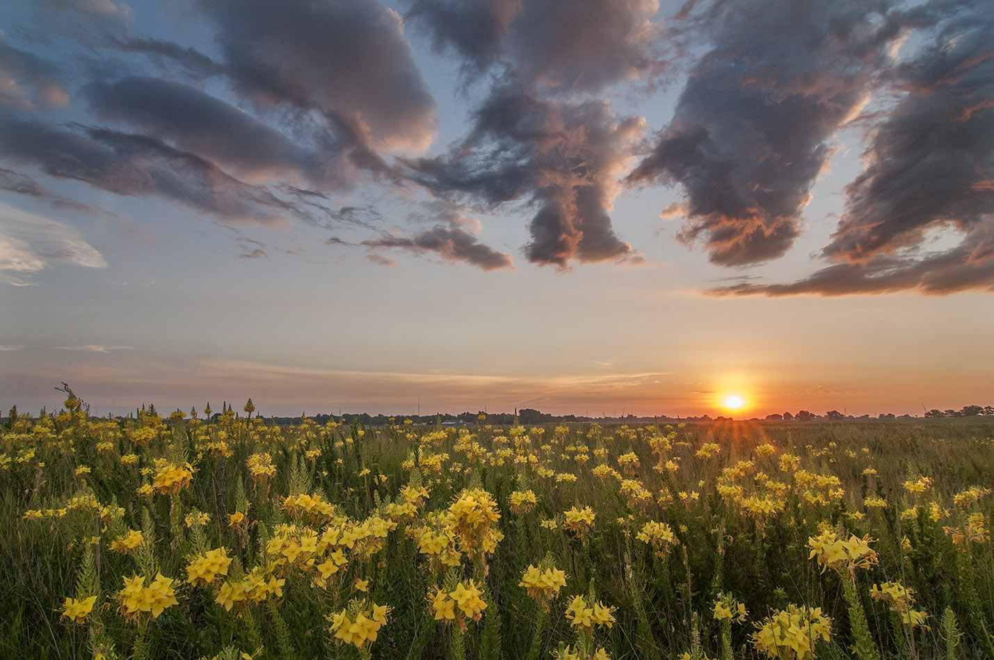
This is a photo I used as part my “Photo of the Week” series back on July 24. I like it very much, but also like the next photo too! (below). We’ll call this Photo A.
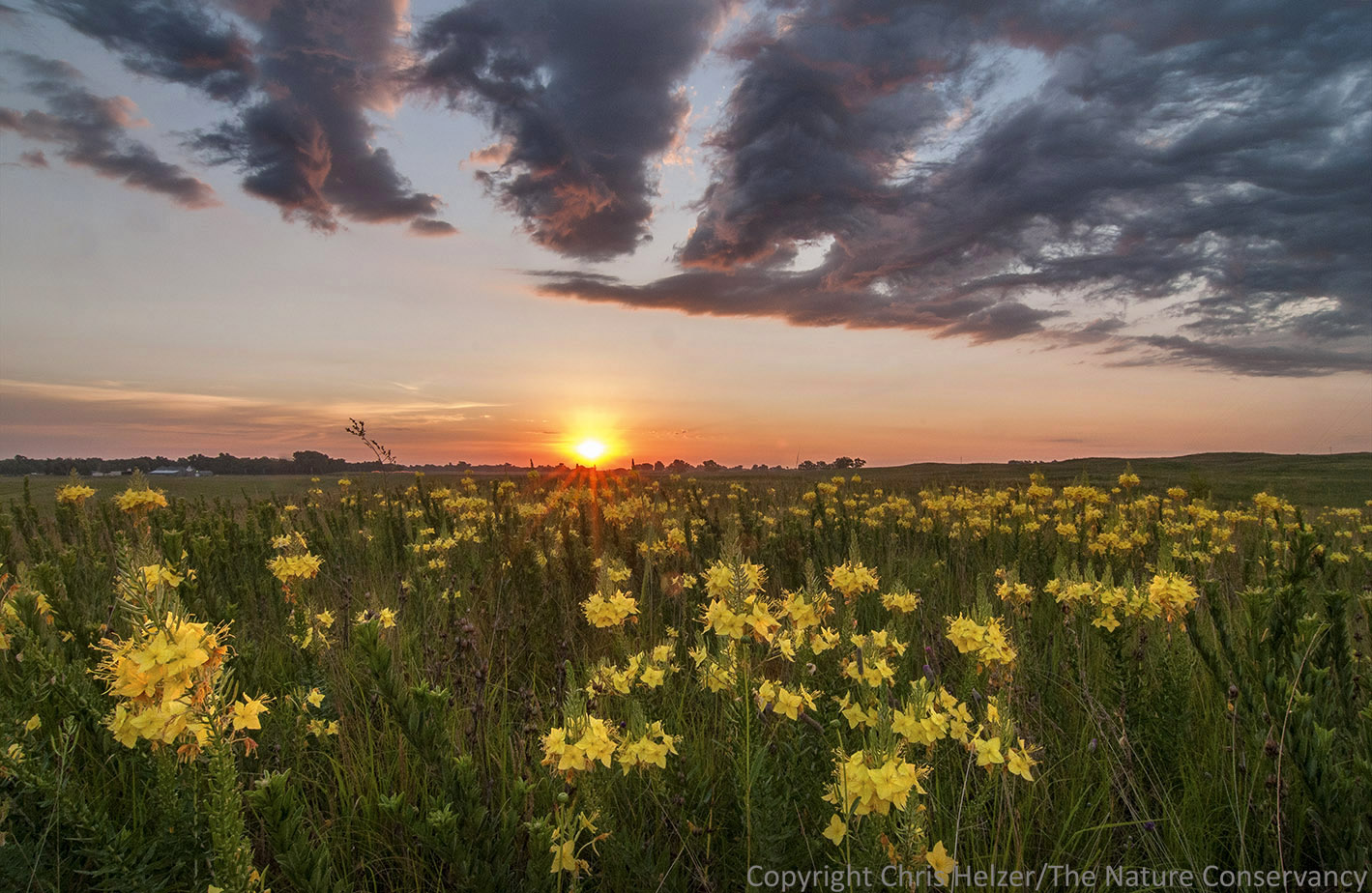
This photo was taken within just a few seconds of the one above. Which do you like better? This is Photo B.
.

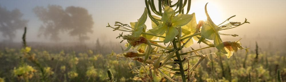
This bee appeared in a post earlier this week. This is Photo C.

In this second version (Photo D), there is no anther blocking the view of the bee’s face, but the bee’s face is more in profile. It might seem like a tiny difference, but I think Photo D has a less personal feel than Photo C.
.

This photo of Maximilian sunflower blossom (from the “wrong” side) feels a little off-balance and includes a stray bit of leaf to the left. This is Photo E.

This (Photo F) is a more conventional way to shoot a flower (though still from the wrong side). The composition is tighter on the flower and feels more balanced. The flower is “looking” out the right side of the frame, but placed a little to the left to compensate for that. Despite all that, I think I like Photo E better… Am I crazy?
Let me know if you have opinions. If not, feel free to just enjoy the photos!

1 in pair one 2 in pair 2 and 1 in pair 3. Great shots!
The first one in each pair. The tilted cloud line in second photo seems to disorient me. Like the larger bee in the first photo. Like to see more of the flower in the first photo. Thanks!
A C E.
A over B because I love the shining, reddish color uner the clouds.
C over D: The bee seems to be looking at you.
E over F: I think that the extra leaf makes the composition more interesting.
All terrific shots. :)
I totally agree with Bob – especially that they are all terrific shots!
I’m going with A, C, and F.
If I were asking for comparisons, my snarky friends would say: “You have way too much time on your hands. Those are all great photos!”
A, C, E
A – I like the perspective that it goes forever. In B, my eye is drawn to the right side where everything converges and ends.
C – I agree with Bob above, the bee seems to be looking at the viewer. And I guess I like having staring contests with bees??
E – More pleasing to the eye, more natural. F is a little too much “in your face”, screams “HEY, LOOK AT THIS YELLOW FLOWER!!!! NOW!!!!”
And there’s my entirely amateur, non photographer’s opinion.
A- Because it’s balanced
D-Don’t know why
E- Because it’s most interesting
I like A, C, and E. The white bit of cloud on left in A provides contrast and completion. In E, the little scrap of leaf adds context. View C, the more complete view of bee’s face is nice.
I would go with A; I like the sun being off center, it makes the picture feel larger to me.
I like C as well; with the bee looking at the camera it is more personal. With that anther sticking in front of its face it kind of has a bit of a blooper reel feel to it. It’s a great shot!
I would go with E; the leaf in the shot adds some context that I don’t get out of the last picture. It’s just my preference I guess.
All great pictures! It still makes me with I could capture shots that were half this good! :) Keep up the good work
A
C
E
Image A stands out for multiple reasons – the position of the sun (think rule of thirds), the cloud arrangement, and the flowers (more abundant in the foreground.
Image C simply because the head of the bee is higher and face is more visible.
From the E/F pair, I prefer F. Compositionally, I see two things happening. It is often desireable to balance the main subject with something else (the leaf in E). Another tool of composition is to have items extend beyond the edge of the image. Though this occurs in both images, I think it is more effective in image F, where more of the petals extend beyond the edge of the frame.
I like B, C, and E. Of the first two A is all about the flowers, whereas B is all about the place, with the balance between the settlement on the left and the swelling prairie to the right. C give a better sense of what the bee actually looks like than does D. And I agree with you that E is the more satisfying of the two Maximilian sunflower photos, with the bit of leaf hinting at the whole plant, rather than just showing the flower.
All of the photos caused me to be homesick for the Sandhills Chris, and I liked all of them. I look at your photos each posting and each time ‘go home again’.
A, C and E
Both A and B have strong points. I like the offset sun in A and the clouds dont make me tilt my head when viewing. However, B has better foreground composition. Overall, I would select A.
Your comment about the personality in C is spot on…C is the winner here for me.
E and F is tough like A and B. I like the close feeling of F, but I love the slightly warmer tone and especially the accessory leaf in E. I wonder if a slightly sharper angle on F could have captured that leaf without losing your light and shadows.
Great Pics!
I like A (I like the off-center sun and clouds) , C (That little face), E (just because).
I planted Maximilian bare roots this spring and they exploded! I’ve been enjoying the pollinators and Goldfinches they attract.
My vote is A, C, F.
HiChris, A, c and e. I think they all convey more energy. Thanks for the photos and interactive activity. Katie Blesener
Sent from my iPhone
ACE!
I vote B (with the sun’s rays, C, & E…..all are so good it is hard to decide….
I was going to comment, but Bobby C. already said it all.
A, C, E
A,
D,
E
olderthandirt :)
A over B (the light on A is glorious), C over D (yep, seeing the bee head on makes it much more compelling), and E over F (the light is just better in E – but I would probably crop out the leaf). Cool shots, all.
Personal preference of course. I like A over B love the colour and dimension, but B makes me feel squirmy since unfortunately I suffer form vertigo, and even this is affecting me strangely.
C over D I love the fullness of the bee. However to be a bit whimsical on D the bee looks bashful.
E over F. I like unusual and the off-centre flower with the bit of leaf shows more depth.
But I have to say I have enjoyed so many of your photos, your posts are 1 of my highlights in going through my emails. Please continue
Sandra
I like A because of the off-center Sun placement.
C because I like looking at the bee face on.
F because I like the closer look at the phyllaries and receptacle of the sunflower.
B C E – Just went with my gut feeling. :)
A, for sure. The clouds seems more balanced with the sky and it lacks the flowerless blotches of the 2nd one.
C. It shows more of the bee’s face, even if obscured by a stamen.
F. The stray leaf is just too distracting.
# 1 in the first set; #1 in the second set; and #2 in the third set. But they are all beautiful!
A, C, F