I’ve never had any formal visual art training, notwithstanding my elementary teachers’ efforts to show me how to color within the lines. When I started getting serious about photography, most of I what I learned was from books and photographers who were kind enough to offer helpful critiques of my work. In my early days as an insecure nature photographer, I spent a lot of time paging through magazines and how-to books, looking for photos I liked. Then I tried to mimic those compositions in my own work. I was also very earnest in my attempts to learn and follow the rules of composition mentioned in photography books and magazines.
One particular rule I remember reading about said that when photographing animals, you should always have them looking in toward the center of the photo rather than out toward the edge of the photo. For example, compare these two photos of an upland sandpiper (actually one photo that I cropped in two different ways for illustrative purposes).

In the top image, the bird’s eye is near one of the “power points” of the rule of thirds, so it conforms to that particular rule. However, because the bird is on the right side of the frame and looking toward the right, the photo seems unbalanced. In the lower image, the placement of the bird on the left side leaves it more space, and most people probably feel the bottom image is the better composition of the two. If nothing else, the top image creates a kind of mental tension, in which the viewer feels there’s something wrong, or at least uncomfortable, about the composition.
Creating tension or discomfort, of course, can sometimes be a powerful strategy for artists, and can set their work apart from that of others. As for me, though, I’m not really much of a risk taker when it comes to composition. In fact, I looked back through quite a few of my photos as I was thinking about this blog post, and couldn’t find many where I had intentionally created a visually jarring composition. For better or worse, my objective is usually to draw people into a natural world they might not otherwise become familiar with, so making them uncomfortable seems counterproductive.
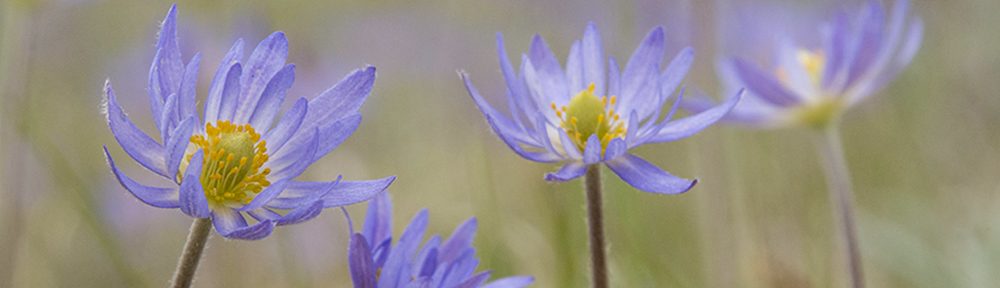
I don’t do a lot of traditional wildlife photography; I spend much more time photographing insects and flowers. As far as I can tell, the aforementioned rule about having an animal look toward the center of an image seems often to apply to flowers too, which is a fascinating thing to ponder. As viewers, are our minds projecting an imaginary face onto flowers, driving our expectation of how those flower photos should be composed? Or is composition more driven by other factors, such as the curvature of the flower stems or the balancing of subject matter?

Consider the stiff sunflower image above, one of my favorite flower photos. It would look odd (wrong?) if the flower were moved over to the right half of the image, right? Is that because we ascribe a face to the flower and expect it to look in a certain direction relative to the photo composition? Or is it just because of the way the curving line of the flower bends pleasingly toward the center in this photo, rather than away into nothingness if it were moved to the right? Regardless, there’s something important about keeping the flower on the left side.

Now look at this photo of two Maximilian sunflower blossoms (above) I took last week. The closer flower is the focal point of the image, and its “face” is “looking” toward the center of the photo. The photo seems pretty balanced this way. Compare that to the photo below, in which that same focal flower is moved over to the left. It seems to be breaking the rules, yes? Both photos have a second blossom in the background to balance the one in the foreground, but the second photo is still a little jarring because of where the face of the main flower is pointing.

Here’s the thing, though… I think I like the second photo at least as much as the first, and maybe better. There’s a slight tension in the image that I don’t think is too distracting, but instead makes the image interesting. It makes me want to see more, to see what the flower sees. Am I crazy for thinking the second is the more captivating of the two images?
…Good grief, does this mean I’m moving toward becoming a provocative art photographer??
The next thing you know, I’ll be putting horizon lines right smack in the middle of photos solely because the rules tell me not to. Even worse, I’ll start writing long self-absorbed blog posts exploring the artistic choices I make when creating images…
…oh, wait…
Dang.

I like the fact that you can be a rule breaker – great photos and great info to encourage others to stretch themselves!!
HAHAHA! Whether you are a rule breaker or rule maker, I always enjoy your photos. They always make me wish I was there. I think the curve of the stem does something for your second Maximilian photo. They are both excellent.
I still check out your essays, Chris, as long as the art doens’t overwhelm the prairie ecology.
Chris,
The only real rules in art are the ones you make for yourself. Of course some things look better than others and many works follow the “rules” but who really cares, if the image looks good go with. Of course that can become a rule also, so confusing this art game.
The 2nd one has an “in your face” or “look at me” quality that I really like. Also, whether real or not, to me there’s an appearance that the flower is being blown forward by wind allowing a momentary peek at what’s behind and I like the “peep behind the scenes” aspect!
I also like the 2nd photo of the stiff sunflower best. But, I believe that is because the curving line of the stem suggests movement to me – so the photo evokes the feeling of the wind blowing against the flower and pushing it to the left. If I look at it long enough, I can almost see it bob in the breeze.
whups – Maximillian, not stiff.
Just keep taking photos. By any rules you choose! :)
I love your writing…I am always thinking about this kind of thing!
Once again, you brightened my week! Thank you.
I guess I’ll be the contrarian and say I like the first maximillian photo, I think because in the second, the stem disrupts the view of the flower behind it, whereas in the first photo it does not. To each his/her own. I don’t feel there are right “answers” in art, just preferences.
I prefer the first sunflower image. To my eye, the right third of the second image seems to be wasted space and doesn’t add anything. I think having space in front of the “face” of a flower works because it gives room to wonder and creates “tension” – Is something going to appear? Did a bee just leave? I also think the stem dropping from the center of the image to the bottom leads the viewer out of the frame and there is nothing there to pull the eye back.
If you really want to be daring with the cropping – remove that 1/3 of the image and crop to a 1:1 ratio. No one says the photo has to be the 3:2 ratio stipulated by the camera. It would also look good cropped in to a 2:3 portrait focusing just on the flower.
LOL, I should learn more about photography. I kept looking back and forth at your photos, and couldn’t decide if I had a preference. What I do, is take LOTS of photos of the same things, and then choose what I like the best to post on my blog or Facebook. I wonder if the ones I like the best have followed any rules.
Great photos, of course, but also delightful writing!
Thank you!
Interesting post Chris! I prefer the first image of the flower. I like that it has room to “breathe.” The other flower appears to close to the left side.