Non-scientists probably see the word ‘data’ and immediately glaze over. To me, data (especially MY data) is a window into the fascinating complexity and patterns that would otherwise be hidden from me.
I’ve been deep in the data analysis mode over the last several weeks. I’m wrapping up a couple 2-4 year research projects this year, but am also continuing to plug away on collecting and analyzing long-term plant community data from some Platte River Prairies restoration projects, some of which I’ve tracked for 22 years now. (As an aside, that long term work takes me about 4-5 field days during the summer and 3-4 analysis days in the non-field season. I feel like it’s well worth that investment.)
I’ve learned a lot from that long-term data over the years, especially in terms of how well prairies can maintain species diversity in the face of various weather and management stresses. Breaking down the data to look at the impacts of individual fire or grazing events has also been fascinating. Most of all, though, the data help generate questions that I would never have otherwise thought to ponder.
Today’s post is going to be SUPER graph heavy. Feel free to take a pass if you’re mostly here to look at pretty photos – I won’t be offended. However, what I’m hoping to do is show how much fun it can be to see a pattern in data that triggers a question. There’s a lot of wondering expressed in this post, rather than dry exposition about how prairies work.
Still, it’s a lot of graphs. I threw in one photo at the end, just to say I had. Enjoy. Or feel free to go outside for a hike or something.
As always, if you want to look at these images up close, click on them. If you’re reading this in an email, click on the title of the post at the top to open it online and allow you to click on images.
A quick word on how these data were collected before I get into the fun stuff:
Each year, I take a 1 meter square plot frame and plop it down in 70 or more places, stratified across each of the prairies I’m tracking. The sampling plots are not in the same location each year, but are relatively evenly distributed across each site. At each of those 70 sampling points, I list all the plant species inside the plot frame. From that plant list, calculate the average species richness of a square meter of that prairie and see how that changes over time.
I can also add floristic quality into the mix, using a subjective, but expert-driven set of ‘conservativism’ values assigned to each plant species by botanists. Those values indicate how tied a plant species is to habitats that are more or less degraded in ‘quality’ through human disturbance. The highest values are given to plants restricted to non-degraded habitats. I calculate the floristic quality of each square meter sample and then average it across the site. If you’re not familiar with floristic quality, I’ve put more information on floristic quality and how/why I’m using it at the bottom of this post.
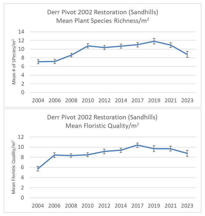
So – to the data! In Figure 1, above, you can see that both the mean species richness and mean floristic quality of this restored prairie increased for several years and then mostly leveled out. The 110 acre hilly sand prairie just south of the Platte River was planted in November 2021 with 165 species. It took awhile – maybe until 2006 or 2010, depending upon which metric you look at – for those species to fully establish into a community. Since then, it’s been managed with fire and grazing to create a ‘shifting mosaic‘ of habitat structure and to maintain plant diversity.
Everything looks pretty good in those graphs, with the possible exception that there seems to be downturn in the last year or two. Aha! A question has been triggered! WHY is the species richness and floristic quality going down now?
Well, we’ve been in a drought for the last two years, so that could sure be an explanation. On the other hand, Cody Miller, the preserve manager excluded half of the site from grazing in 2022 and all of it in 2023, so maybe that management change (in combination with drought?) is responsible. To dive deeper, let’s look at some of the individual species and how they’ve been trending:

In the top left graph of Figure 1, you can see that big bluestem, Indiangrass, and Junegrass have been steady to increasing in their frequency of occurrence in recent years. The top right graph shows that switchgrass, short-beaked sedge, and Canada wildrye all took dives in occurrence between 2021 and 2023. That group is particularly interesting to me since they were on very different trajectories from each other until the last several years. Why, now, are they reacting the same way to the drought – or whatever is driving them downward in occurrence?
To make things more interesting, the bottom left graph shows three grasses that moved in the opposite direction of those in the top right graph. Prairie sandreed, sand lovegrass, and Scribner’s panicum all took a big jump between 2021 and 2023. To round out these four graphs, the bottom right shows five perennial forb species that took big dives in occurrence during that same period. Stiff sunflower, yarrow, heath aster, Canada goldenrod, and stiff goldenrod all showed up much less frequently in my 2023 sampling than they did in 2021.
I don’t have explanations for any of these patterns at this point. Maybe looking at a second site, right across the road, might help?

The 69 acre Dahms 2000 restoration was planted in the winter of 1999-2000 with 202 plant species. The patterns of mean species richness and floristic quality look very similar the first site, including a dip in species richness between 2021 and 2023 (though floristic quality didn’t go down much). Interestingly, this site has had recent management comparable to the first site, in that it was rested completely in 2023 and didn’t have intense grazing pressure in 2022 either. It obviously also faced the same drought conditions, as well.
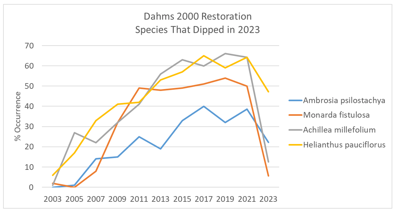
The graph in Figure 4 shows four perennial forbs that declined between 2021, with two of them (wild bergamot and stiff sunflower) showing particularly steep drops in occurrence. Stiff sunflower also showed that pattern in the 2002 restoration, as well as in the Derr West 2002 restoration that I’ll be featuring next. That’s three sites, all with similar management and drought conditions, in which stiff sunflower has had a bad year or two. Is that a pattern that means something? Good question. Hang on to it until we get to the fourth site.

The graphs in Figure 5 show two grass species increasing in their occurrence and two that have declined in recent years. The two increasers, Scribner’s panicum and switchgrass, are in the same genus, so they’re closely related, but they look and act very differently. Scribner’s panicum blooms early in the season and has a very short stature. Switchgrass blooms in the mid-late summer and grows tall and dense. I wonder what’s making both of them become more common as other species are being diminished?
Little bluestem and tall dropseed both increased for the first dozen years of the prairie’s life and then have fallen off since then. I think that’s because the competition around them has gotten stronger as the prairie has matured, but I don’t know that for sure. My guess is that they’ll both stick around the plant community, but have been reeled back a little in terms of their abundance. That’ll be interesting to watch over time.

Figure 5 shows a group of species that I noticed all had big spikes in their frequency of occurrence in the year after the worst single year drought in history (2012) experienced in our part of the state. Look at that! Here are five species that might be great indicators of a prairie stressed by drought. I immediately looked at the same species’ trends in nearby sites to see if they’d performed similarly there. They didn’t. Oh well. I shouldn’t be surprised. That doesn’t mean these aren’t good species to watch, it just means that their reactions are probably tempered by site conditions, local management, etc. – not just weather patterns.

The third site I’m sharing data on today is a 68 acre wet-mesic prairie planting just north of the Dahms 2000 site. It was planted with 218 species of plants during the winter of 2001-2002 and I featured it in a blog post last year. I’ve sampled this site annually since 2004, but am showing you the data since 2008 because that’s when we installed a grazing exclosure to use as a comparison. It’s not a replicated experiment, so it’s important not to over-analyze these results, but we use it as a helpful way to see whether our grazing management seems to be working or not.
In Figure 6, you can see that both the plant species richness and floristic quality have been pretty stable over time, and that the grazed and ungrazed areas follow similar patterns. The grazed area has higher mean species richness, but nearly identical mean floristic quality. Having this data has reassured us that the management we use to create varied habitat structure isn’t degraded the plant communities – at least compared to management using just a 3-4 year burn frequency.
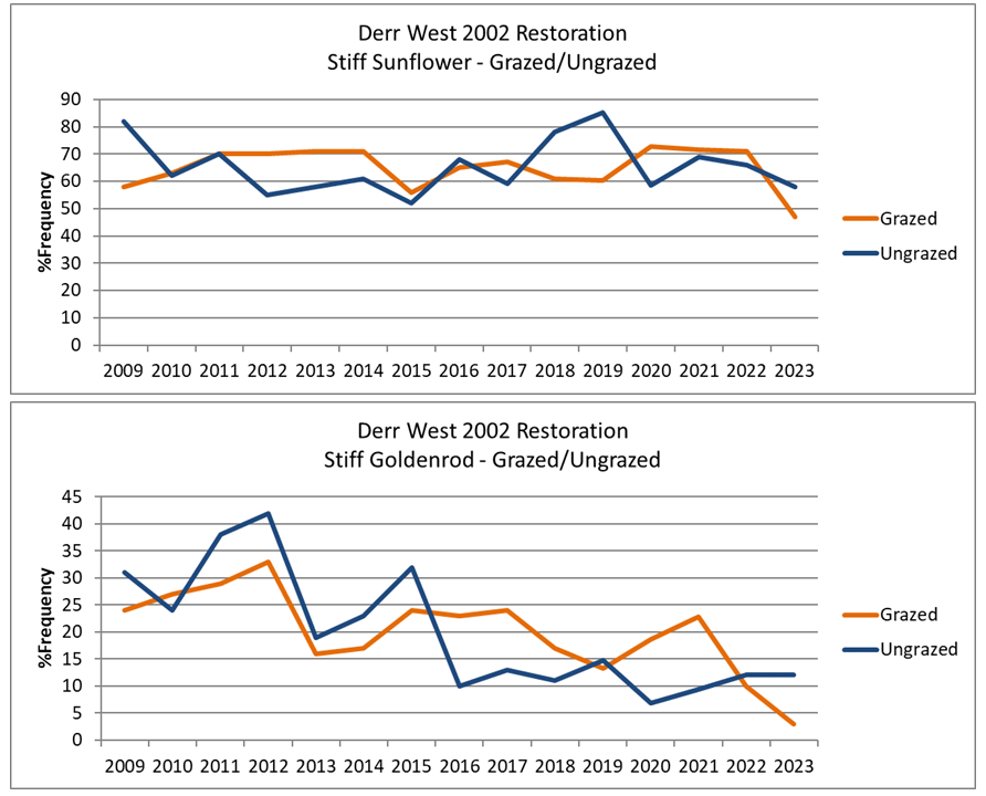
In Figure 7, you can see how two perennial forbs have changed in their frequency of occurrence in both the grazed and ungrazed areas. Neither of these species seems to be very much affected by grazing. I’m surprised by that, since stiff sunflower is pretty attractive to cattle and I usually think of stiff goldenrod as a plant that increases under disturbance. These graphs have made me second guess those assumptions, which is helpful.
Now, I need to spend time in the field and in my data, reassessing what might drive them. Are they responding differently at this site than others? If so, why? Also, I wonder if stiff goldenrod will eventually disappear from this site. I doubt it, but is surely is trending pretty steadily downward.


When I look at a cattle-grazed site in our Platte River Prairies, switchgrass is usually much less intensely grazed than big bluestem or Indiangrass. Big bluestem and Indiangrass plants will be grazed to the ground, but switchgrass is often left with much more standing vegetation and more flowering stems at the end of the season. As a result, I’m at a loss to explain the differences between how switchgrass and Indiangrass seem to be responding to grazing at the Derr West restoration (Figure 8). Relatedly, I also can’t explain why Indiangrass produces an incredible number of flowering stems in some years and not in others. I’ve not been able to discern a pattern yet.
Switchgrass is increasing in both the grazed and ungrazed areas, but Indiangrass is only increasing under grazing. I know this site well, and I know Indiangrass is grazed hard, especially in years when it’s in a burned patch within our patch-burn grazing management. Why, then, would it respond so positively to grazing? I used to assume that switchgrass would benefit from grazing because it should gain a competitive edge over other common tall grass species that are grazed harder. I’ve not seen that come to pass, though, and these data provide additional evidence that my early assumption was wrong. Very cool.

Before I wrap this up, here are a couple graphs from a fourth site. This is the oldest planting I’m tracking. It was planted for us back in the spring of 1995 by Prairie Plains Resource Institute and had about 150 species in the seed mix. When I started my land steward job with The Nature Conservancy in 1997, this planting looked like a weedy mess, and it took several more years after that before it began to look like a prairie. While it established slowly, though, it has shown itself to be a resilient site ever since. The two graphs in Figure 9 back that up, showing very consistent mean species richness and floristic quality over time.
Notably, this site doesn’t show the decline in species richness between 2021 and 2023 we saw all three of the other sites I’ve talked about. It’s only a half mile away from those other sites, so the drought conditions were the same. Interestingly, management was also pretty similar – it rested from grazing all of 2022 and the first half of 2023 (I collected data in early July before cattle came in). Why didn’t this site lose plant species richness under the same management and drought conditions? I have no idea, but I’m guessing soils have something to do with it.
I say that, but the soils maps show that the soils are nearly identical between this 1995 planting and the Derr West 2002 planting. All I can tell you is that the 1995 restoration has always been a little different. I can’t explain why. Yet.

Figure 10 shows the frequency of occurrence of four forbs at the Dahms 1995 planting. In the top graph, you can see that the stiff sunflower population seems very stable, and didn’t seem to decline in occurrence between 2021 and 2023 like it did in all three of the other sites. In fact, both stiff and Maximilian sunflowers occurred at almost the exact frequency in 2023 as they did back in 2002.
I can’t explain why stiff sunflower didn’t decrease in abundance here like it did in the other three sites, but it definitely makes me question whether drought was the driver in those other locations. (At the same time, it occurs less frequently overall in the 1995 restoration, and I have less confidence in the year-to-year patterns of species with low abundance because the sample size is low.)
The bottom graph in Figure 10 shows two prairie clover species that are said to be vulnerable to cattle grazing. Prairie clover is definitely attractive to cattle in our prairies, but I’ve not seen evidence that their populations are negatively impacted by being grazed. This graph sows that both purple and white prairie clover populations are doing about as well now as they were back in 2002.
I didn’t show the graph in this post, but the grazed/ungrazed comparison in the Derr West 2002 restoration actually shows prairie clovers with higher populations in the grazed portion of that site. Similar to the Indiangrass phenomenon, I can’t really explain why this is happening, other than that the plants must get enough rest from grazing to recover and/or thrive.
As I said at the beginning of this post, I love having data like these to pique my curiosity. In addition to generating questions I might not otherwise think of, the data also help me test assumptions. Many of my assumptions have not been supported by the data, which shows how dangerous it can be to rely solely on observation.
For the last 20-22 years, I’ve been spending about a week and a half a year collecting and analyzing data from these four sites, as well as some others that I sample more sporadically. I started doing it when I was a land steward, and have continued as I’ve changed roles and become more of an advisor to our land managers.
To me, that week and a half seems like a very smart investment, given what I get out of it. The knowledge I’ve gained has been really helpful. Even more, the energy I get from seeing and trying to understand patterns in the data keeps me much more interested in these prairies and their management than I otherwise would be, and I’m really grateful for that.
.
.
Here’s more information on Floristic Quality – only if you’re interested in learning more about it:
Floristic quality was initially developed as a way to help quickly evaluate the conservation value of land parcels to help with prioritization of conservation efforts. Typically, a single value was assigned to a site, based on an inventory of plant species across that entire parcel of land. See Swink and Wilhelm (1994) for more details or read this summary/critique.
Based on consultation many years ago with Bob Unnasch and David Maddox, both with The Nature Conservancy at the time, we started calculating floristic quality for each of my 1 meter plot samples and then averaging the results across a site to get ‘mean floristic quality’. We hoped it would be a way to look comprehensively at how a plant community changes over time.
This is the publication most of this has been based on: Swink, F., and G. Wilhelm. 1994. Floristic Quality Assessment. Pages 11–18 in Plants of the Chicago region. Indiana Academy of Science, Indianapolis, Indiana, USA.

This is really interesting, and I share your love of the data and of what looking at it does to foster curiosity. Thanks for this. One thing that leapt out to me was that 2018 species were planted on the 68 acre wet-mesic site! I think you mean 218 species, not 2018. Even 218 is impressive.
Thanks, and great catch. I’ll make that edit!
I love you! I am a prairie person for decades and believe in the research you do. Interesting and thanks
Graphs are beautiful too! Thanks Chris.
So – to the data! In Figure 1, above, you can see that both the mean species richness and mean floristic quality of this restored prairie increased for several years and then mostly leveled out. The 110 acre hilly sand prairie just south of the Platte River was planted in November 2021 with 165 species. It took awhile – maybe until 2006 or 2010, depending upon which metric you look at – for those species to fully establish into a community.
I believe it should be November 2002 instead of planted in 2021. Very interesting data, excellent post.
Really appreciate your work. Thanks for sharing it with us. Things like this always remind me of one of Jim Corbett’s realizations, that in terms of understanding the natural world, even after a very long lifetime of intense observation and study, he was still only at the beginning.
So I read this all with great interest and deep appreciation for the much needed long-term research…thinking, “there will be a lovely photo at the very end. ;) There did seem to be an anomaly with the dates early on but maybe it was just me. I love everything you do… I honestly believe our best hope of saving ourselves is to know as much as we can about plants in every region. Thank you!
Pingback: Visualizing Plant Community Change | The Prairie Ecologist