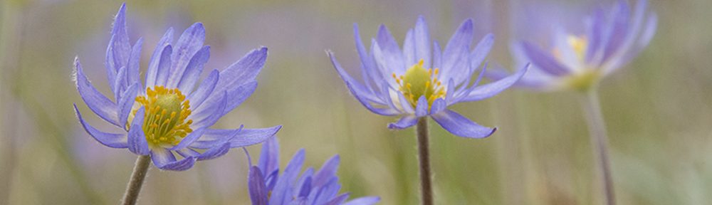
Back in July, I got to photograph flowers and insects at The Nature Conservancy’s Bluestem Prairie in Minnesota. One of the subjects I enjoyed photographing was a little yellow-flowered plant in the genus Lysimachia. I don’t know the name of the species (I’m sure someone will tell me what it is, which would be fantastic).
I played around with the background in my Lysimachia photos. I moved the camera slightly up and down, changing what was visible behind the flowers. The problem with doing that, of course, is that I had to later decide which version of the photo I liked better. Or, as I sometimes do, I get lazy and just put multiple versions in a blog post to see if you have a preference.

Version 1. (a little lower perspective to show a little sky in the background).

Version 2. (the camera was a little higher so the sky is not visible.)
If you have strong feelings, let me know if you like one or the other better, but don’t feel obligated to encourage my laziness.
And, just for fun, here’s a completely different composition of a different plant of the same species (from the same morning). I actually like this composition less well, partly from an artistic standpoint, and partly because I just think the two earlier images better represent the way the flowers tend to delicately droop on either side of the plant.

Version 3. (Different plant, same morning)
Someone I know, not-to-be-named, likes the last composition much better than the first two. That person is wrong, but to be fair to them, I’m including the composition in the post. I’m sure all of you will agree it’s nice, but not as good as the first two…
Right?

Sorry, third is best. She who shall not be named is right.
Third is definitely best. The water drops add another layer of visual interest.
I like the first for its delicacy, and it doesn’t look cropped. The tip of the plant is visible. The coloring is soft and it matches the feeling you get by looking at the flower in real life. If you want a stronger impression of the flower take it half a stop down and add a touch of contrast and you have it, but include those delicate tips to get the full idea.
I like version 1 best due to the background coloring and the fact that the entire leaf shape is visible (and the one in front is so in-focus, while the one behind is not). #3 is also a great shot, the flower jumps out from the background and the unique petal shape is apparent.
I think that your flower is Lysimachia quadriflora.
I like the 2nd image best as a lighted area like the sky in the first image tends to draw one’s eye
to that area.
It looks like Lysimachia quadriflora to me! I’ve seen that flower at Bluestem before as well.
The plant is Lysimachia quadriflora. A local steward established this plant in a restoration and increased it greatly through out the site by carefully collecting seed and spreading it into favorable areas over the course of decades.
FYI, the steward’s biggest problem was the deer kept eating all the plants. He had to cage the few patches that had initially gotten established to get any seed for additional restoration efforts.
As a picture of a flower, I like the 2nd picture. As a work of art, I prefer the 1st. To me, the first picture is much more complex – a small beautiful object growing in a big “hard to comprehend” worldl
The first photo is a piece of art. The sunlight on the lower half of the stem and the light on the upper surface of the right hand flower let’s you know the time of day and that this is an in-nature composition.
You are a very brave man not accepting the comments of the special other person. Hope your couch is extremely comfortable.
I prefer the first. The lighter background balances the plant better – the interesting foliage above the flowers is lost in the second image.
They are all good for various reasons, as noted above. Beautiful. Thanks for sharing.