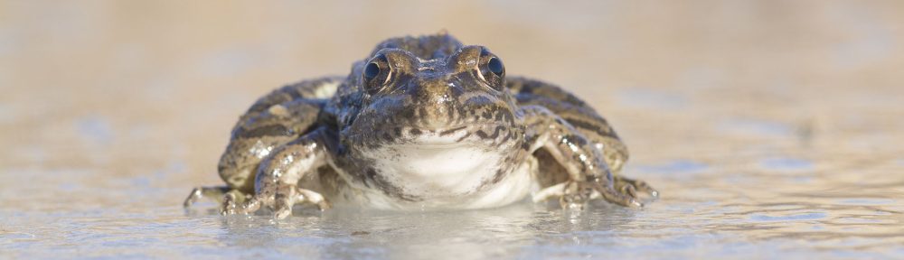
There are reasons I am primarily a bug and flower photographer. One of the biggest of those reasons is that bug and flower shot compositions are pretty simple.
Look – a flower!
Or Look – a bug!
Or sometimes Look – a bug on a flower!
One subject, simple background. Piece of cake.
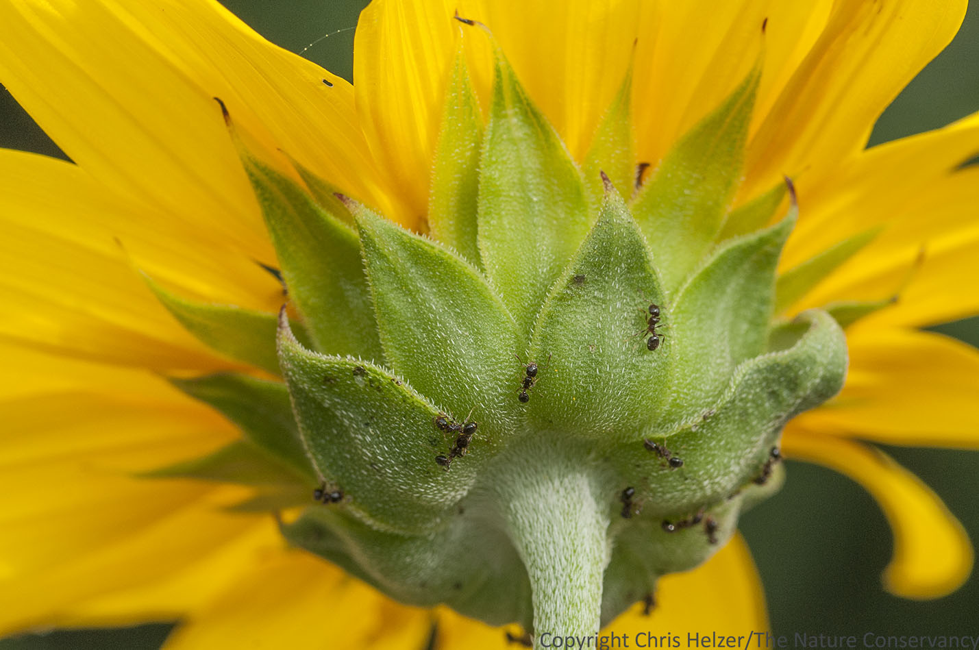
Ants looking (I assume) for extrafloral nectar on annual sunflower (Helianthus petiolaris). The sweet substance produced by sunflowers and some other wildflowers attracts ants, which – in turn – may help repel herbivores. Nebraska Sandhills on the Valentine National Wildlife Refuge.
I admire good landscape photographers but I feel completely inadequate every time I pretend to be one. While I’m composing landscape images I usually spend a lot of time fretting and second guessing about foreground, horizon line placement, and other factors that don’t come into play with close-up photography. For whatever reason, my brain is wired such that composing close-ups of bugs and flowers comes intuitively but landscape photos are mentally painful.
That said, there are times and places when even I can take a decent landscape photo. Last month, I was on a ranch in the Nebraska Sandhills, possibly the most scenic grassland landscape in the world. The light was great and I had a little time, so I aimed my camera at a windmill and hay bales to see what I could do. I took a lot of shots, and though I kept feeling like I wasn’t quite capturing the essence of what I was seeing, I liked the photos well enough. After about 20 minutes, I had about 100 different images that were all very similar to each other and the next challenge was to narrow it down to my favorite. I almost got there – I got down to two.

Windmill and hay bales on a ranch in the Nebraska Sandhills. Composition 1.
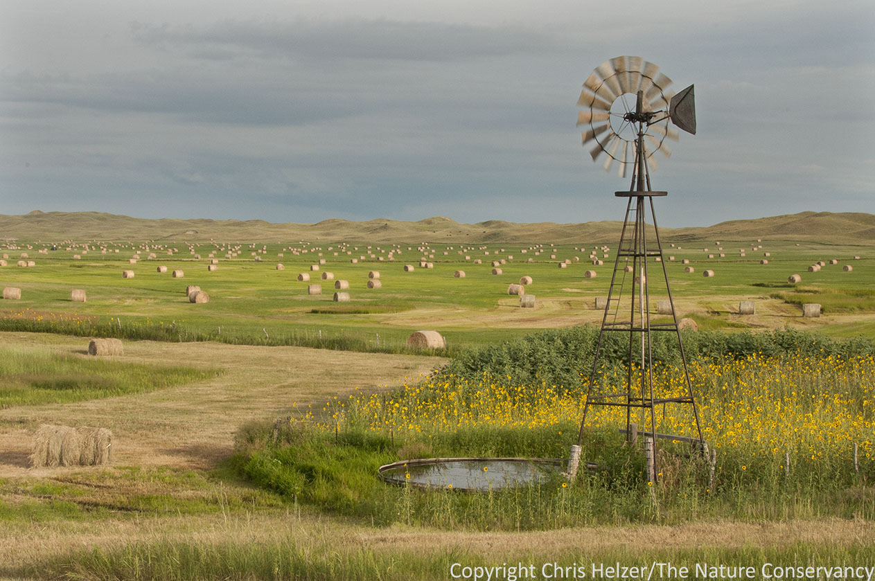
Composition 2.
Maybe you can help. Let me know if you like either of these two images, and if so, which you like more. In the meantime, I think I’ll go look for a bug. On a flower. Something my brain can handle.

Both are nice, but slight preference for #2 where the background doesn’t cut through the windmill. It is easier to see both windmill and sand hills in the horizon in #2.
Kim Sosin
I like them both but because of the photo angle, the top photo emphasizes the bales, and the bottom photo emphasizes the windmill.
I agree with Kim, and for the same reason. The higher angle of #1 would have been very interesting if you could have gotten the windmill entirely below the horizon.
I like composition #1, as it is seems to highlight the vastness of prairie.
More about place, and then what is in it/of it.
Whereas in #2, it seems more about subject, more focused upon the windmill.
If I had to choose something my eyes would rather gaze upon with “prairie” in mind, I would want to gaze upon #1.
That written, I enjoy all of your photos
Both are very nice! I am partial to the first one that has more light contrast, though.
I like composition 2 best, for what it’s worth–something about the slightly different angle on the water and windmill.
I agree with Marnymae above (or below), What I take away from either is the vastness, and #1 seems to capture it better – there is more prairie to look at. However, if you hadn’t asked, I might not have been able to articulate a difference. Keep ’em coming – thanks!
These are good shots. But I would like to see a shot, which I hope you have, taken from in front of, but including from a low vantage, the lone hay bale at the edge of the mowed swath to the right of the center of the composition. The windmill, the tank, the flowers, etc. distract my eyes from the “sweep” and “majesty” of the hay bales that draw the viewer’s eyes to the Sandhills in the background. That lone hay bale, rather than those other items, does a better job of carrying the eye through the other bales to the hills.
I prefer #1 because as both Dave and Marneymae commented the ‘story’ is less about the windmill and more about the landscape – plus I am a sucker for hay bales on the landscape. There’s just something about them … I think it is has to do with how they reveal the lay of the land in a slightly less obvious way than agriculture rows do, but it’s something too about the play of light and shadow and the contrast of gold with the green below. Anyway – they are both great photos but I also like the slightly bluer sky in #1 and the deeper shadows.
I like composition #1 because by showing more of the sandhills and less of the sky you emphasize that the landscape is large, extends quite a distance, and is the featured item in the photo. Your eye can’t help but be drawn to the immense vista. While the windmill adds interest, to me, it is not the real story of the photo. If you wanted to feature the sky, you would feature more if it and less of the sandhills, right? Number 1, all the way!
Probably 2 because the windmill associates with the sky in a more meaningful way.
Plus the photo of the ants on the sunflower involucre is great; those are tiny ants!
I prefer #2 because there is more contrast and the lighting looks richer to me.
Ah, #1 for sure. Horizon at upper 1/3 and the windmill is visible nicely against the broad field of green dotted with hay bales which is really the subject here. In #2 the windmill blades disappear into the sky. The horizon is not the picture but the field is and it all fits together in #1 and as one person suggested even a higher angle shot would have been a little better.
Horizon rule of 1/3s is always a good one. #1 fits that rule and the field is the best subject with the windmill.
Your bug shots are always stunning and your equipment captures the clarity on close ups so well!!
thanks!
I truly miss the “Sandhills” and the pictures here state clearly why I carry sand in my shoes. I like all of the pictures — the windmill choice for me though, is the second one, it has more depth and reveals the size of the meadow. It also makes me wonder about the insects and animals that are hidden from view. Good job Chris
I agree #1. The windmill appears to be in motion in the photo.
The first one – there is less sky which actually makes it stand out a little more and it compliment the greens and tans below. (But really – both are great!) Thanks for sharing them!
My favorite is easily #2, with windmill blades above horizon. #2 also has better, brighter lighting from back of of green grassland through the hills.
I agree about no. 2. I don’t like the windmill interrupting the horizon in no. 1, with a lower viewpoint there is a better feeling of expansive space.
Number 2. I agree with Paul.
First of all, thank goodness for digital cameras. You would go into debt processing all that film. I like composition 1, the darker sky, the windmill blends into the scene. I also love the sunflower and ants. Closeups are the best!
Definitely number 1
Easy peasy. Number two. Nice horizon placement, but primarily because the eye is drawn to the windmill, which gets lost in number one. What a beautiful view!
I can certainly relate to super-macro shots over landscape, I’m the same although my partner takes good landscapes but cannot to a “bug” or “flower” shot to save her life!
I like your top landscape shot by the way.
#1 is the most intimate for the viewer……#2 is equally divided between earth and sky, less interesting…..the golden mean that artists use in composing would divide the image into a grid 3 sections both vertical and horizontal. Best to read a good explanation of it…..I’m afraid I wouldn’t explain it well…..it is a useful tool.
There are really two photos here. The first one is about the hay bales and the meadow; the second one is about the windmill, the land, the sky. For beauty of color and composition I prefer the first; for a photo of the inimitable landscape I prefer the second. In other words, I choose both!
#1 immediately caught my attention and when I panned back and forth between them, I never changed. The Sandhills really stand out.
Missed you at the PBG Working Group meeting. It was another great meeting with spectacular views. You really must visit the Red Hills.
I LIKE #2 with the windmill blades above the horizon.
If there hadn’t been a choice, I would have loved either. I like #1 because it emphasizes the hay bales slightly more, which is just as much a feature of the Sandhills as the more typically featured windmill.
This coming from a landscape junkie.
The second photo steps back just enough to let in more sky. The light rests on the hills is a moment longer, as of reluctant to pass into a shorter day. There’s a Jim Harrison book about the Niobrara where the character Smith asks, ‘ ever notice how the sky is a great pasture of light?’.. Or something close to that. Got to step back to see the distance.
I prefer number one easily. The bales sre more defined, and hills are amazing. As someone posted, more intimate.
I prefer the first one for the simple reason that it is brighter and the elements are easier to see clearly.
Very instructive series of comments, all of which are valid.
Both photos are excellent, but I have a strong preference for #2. To my eye, the windmill is the main subject in this photo, and the other elements, while also important, provide a context for the windmill and give it a sense of place in the landscape. In both photos the windmill is beautifully placed right-to-left in the frame. In #1 the horizon line cuts right through the windmill blades, but in #2 the blades project into the sky without having to fight with the background for the viewer’s attention. Also, the slightly wider field of view in #2 gives the composition more “breathing room,” especially the elements at the bottom and in the lower right area of the frame. The slightly wider band of green at the bottom of #2 anchors the baseline and gives it more weight.
It would be interesting to see a photo with a slightly slower shutter speed, which would have blurred the whirling windmill blades slightly more and provided a contrast with the motionless elements in the remainder of the frame.
I like #2 best. Just looks more balanced to me. I love the windmill, the bales, the sunflowers, and upon enlarging #2, I can see what looks like red angus cows on the hill in the background. Makes me homesick for our pasture north of the Platte Valley near Cozad. Enjoy your postings!
I think the Sandhills need lots of sky to balance them out.
#2 because of more breathing room in foreground and cleaner placement of windmill above horizon. Very nice photos!
#1 for sure. Horizon is perfect and the landscape itself is emphasized. Color scheme is “richer” as well.
I think I prefer Composition #1 Chris. I enjoy your pix. Thanks.
Ron
Hi Chris, You’re more qualified to be a landscape photographer than I am, but here’s my reaction to the two pictures. Both are really nice. I’m voting for number 2 because: 1) I like the light better in the second because it seems more subdued on the windmill, tank and sunflowers 2) I like that there’s more sky in the second which adds to the vastness of the scene and the sand hills, 3) the hills in this shot seem more distant and helps give the feeling that the bales go on almost indefinitely. Again the vastness of the place. Thanks for sharing those. Where were they taken? Ed >
Thanks Ed. The photos were taken on private land not far west of the Valentine National Wildlife Refuge.
Number Two….perhaps it should read, photograph # 2
Both are wonderful photos but I find Composition 1 more captivating. It draws me more into the landscape with its higher angle, deeper hues and brighter light.
I like comp #1. It captures the depth of the landscape better to my eye.
Number 1 only
Like many, windmill is the biggest question.
I like the first since it does not cut the sky, and fills the background gently. Most importantly, it keeps reasonable proportions.
In the #2, it looks out of balance, bigger than it really is, too much invasive.
+1 for Teresa, Dave and Marneymae comments : “the ‘story’ is less about the windmill and more about the landscape”
Pingback: Follow Up: Windmill and Bales Photo | The Prairie Ecologist
I like number one because the subject is the hay field with the bales, framed by the windmill. The light draws the eye toward the center of a peaceful scene. In the other, the windmill sticks up above the scene and you are not as sure where to look–the overall effect flattens the image. So number one without a doubt: the sky did you a favor by illuminating the scene just so. The cut hay also beckons you into the photo. The number two image, by contrast, seems closed with a line of grass that bars you from entering. It’s very subtle and if the clouds were positioned slightly differently, I might like the second composition just as well.