Visualizing Plant Community Change

Quick announcement: if you’re a graduate student doing research related to conservation in the Great Plains of North America, you should check out the J.E. Weaver Competitive Grant Program. We are offering up to five grants of $1,500 each to graduate students. Read more here.

About a week ago, I posted a bunch of nerdy graphs with data from some of our restored sites at the Platte River Prairies. I’ve been glad to hear from at least some of you that found those interesting. However, graphs showing how species richness or individual species occurrence changes over time are interesting, but they only show parts of the overall story. I’ve been playing with another way to better illustrate the full picture of a plant community’s species composition through time.

Photographs can help illustrate what prairies look like and how they change through time, but they only show the plants that are most visually apparent at the time of the photo. This is a 2009 photo of a restored prairie planted in the year 2000. It is one of the two sites I’m highlighting in today’s post.

What I really want to do is to step back and look at an entire plant community to examine how its composition changes through time. The concept I’m sharing today has been useful to me, but I’d love to hear feedback from others. I’d also like help naming the graphics I’ve constructed. When I started, I called them plant community signatures, but that’s doesn’t feel quite right. Help?

(For those of you who are more interested in pretty pictures than data, I did throw in a few recent photos of ice bubbles at the very end of today’s post, just for fun. If you want to see them, however, you’ll have to scroll past all my cool visual data representations first.)

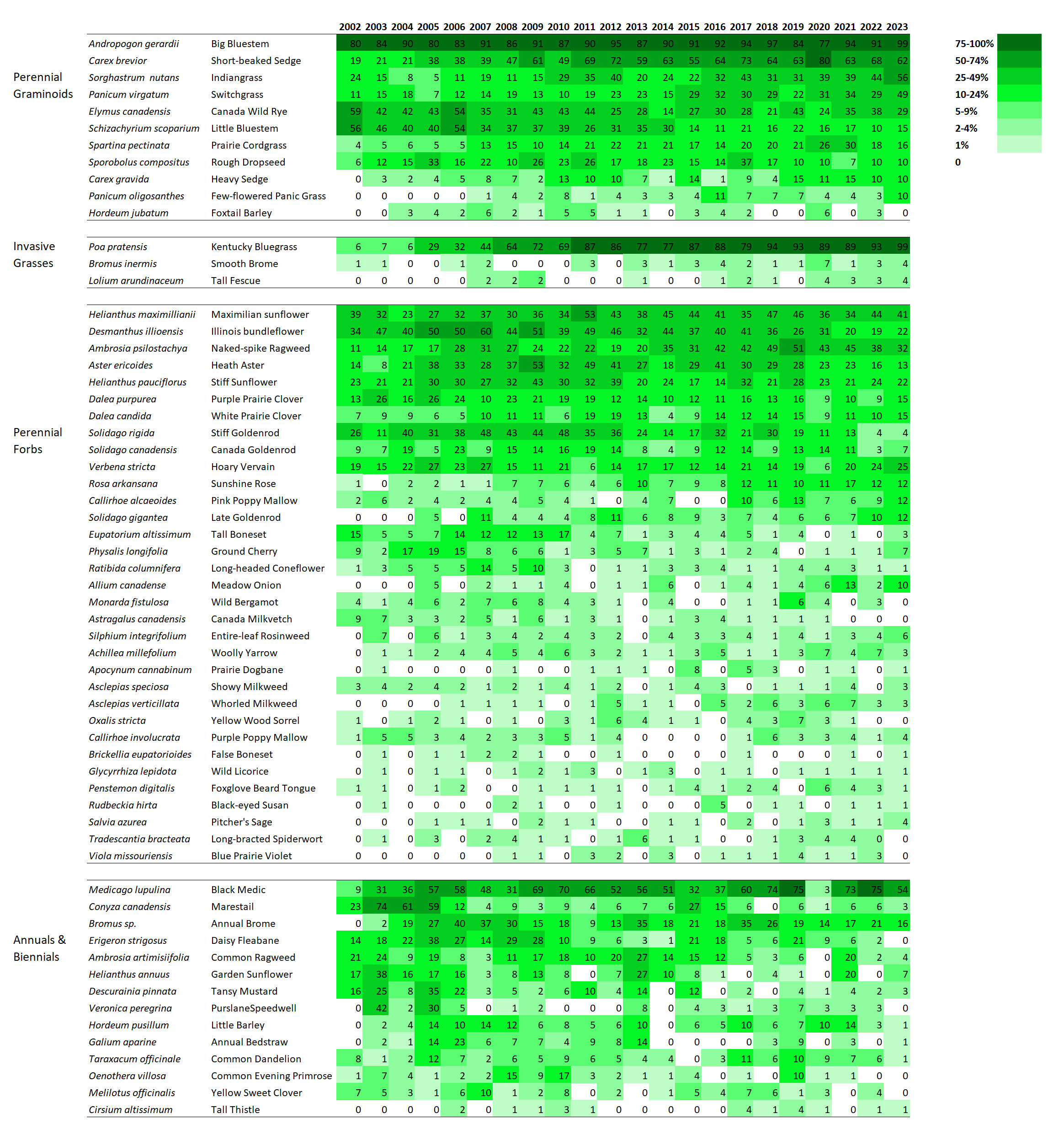
The data used to create these illustrations are the same data I showed graphs of in my last data post. As a reminder, to collect the data, I plop down a 1x1m plot frame, list the plant species within it, and then repeat that over and over across a site (about 70 or more times per site). I can then calculate frequency of occurrence for each species, which is simply the percentage of those 70 or so samples each species was found in.

Once I have the data, I lay it out in a spreadsheet format to display the frequency of occurrence changes for each species through time. However, to make it easier to see patterns, I’ve colored each cell so that less frequent occurrence is light green and more frequent occurrence is dark green. I’ve also tried to group species together in a logical way. The result – at least to me – is a fascinating way to step back and study how plant composition varies over time.

I’m displaying results for two sites here. The first is a 1995 planting that I’ve collected data from annually since 2002. The second is a 2000 planting that I’ve collected data from every other year since 2003. I’m not displaying results for every species – just 60 or so of the species in each site that are abundant enough to be captured fairly regularly in 70 1x1m plots. If you want more details on these sites, you can get it from my last data-heavy post.

SITE 1 – Dahms 1995 Prairie Restoration. A 45 acre mesic site on sandy loam soils planted in spring of 1995 with approximately 150 plant species.

Here is the full graphic for the 1995 prairie restoration. It shows the frequency of occurrence between 2002 and 2023 for each featured species.

Remember to click on the title to open this post online if you’re reading it in an email. Doing that will then allow you to click on each image to see a larger, more clear version of it.

When I stare at this graphic, the first thing I notice is that there are very few examples of species that are on a distinct trajectory of increasing or decreasing frequency of occurrence. Most species simply fluctuate up and down through the years – some more dramatically than others. As expected, most of the most variable species are in the ‘annuals and biennials’ category. I think that’s great, and is evidence of ecological resilience.

Now, let’s look more closely at each of the four categories.

This graphic shows perennial grasses and sedges, including three invasive perennial grasses. Two species show a strong trend of increasing abundance. One is a native sedge (Carex brevior) and the other is Kentucky bluegrass.

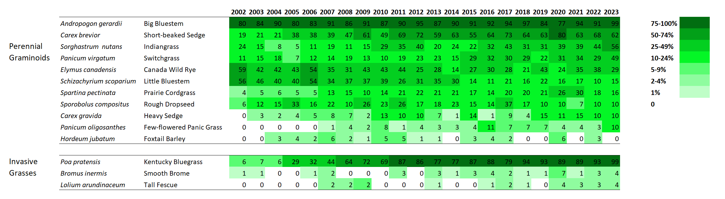
Looking at the perennial grasses, it’s clear that big bluestem has been a dominant feature of this site for the duration. That’s fine, but not particularly surprising to me. What’s more interesting is the increasing abundance over time of both short-beaked sedge and Kentucky bluegrass. I’m happy about the sedge becoming more common. It’s a cool little plant. Kentucky bluegrass, of course, is less exciting because it has the potential to form monocultures and decrease plant diversity.

However, and this is really important, I’m not seeing any evidence – either here, in my other analyses, or on the ground, that Kentucky bluegrass is having a significant impact on plant diversity. Now, that could certainly change, but at least so far, it seems to be just hanging out (though it’s hanging out in a lot more places than it used to). It’s a great reminder that we should always measure the impact of invasive species, rather than just measuring the extent or abundance of the invaders themselves.

I’ll quickly highlight two other species that intrigue me. Little bluestem has become less common across the site over time, though it seems to have stabilized at about 10-20% occurrence in recent years. Simultaneously, prairie cordgrass has done the opposite, becoming more common.

Little bluestem likes drier habitats and cordgrass likes wetter. Does that mean the site has gotten wetter? I don’t think so. Instead, I think what we’re seeing is a long-term self-sorting process of a planted prairie. When the site was planted, the seed mix included way more little bluestem seed than cordgrass seed. As a result, I think the early establishment of those two species wasn’t representative of their actual adaptation to the site. Over time, I think they’ve both shifted around until they’ve settled into the microsites (and abundances) they’re best suited to.

Frequency of occurrence for perennial forbs in the 1995 planting.

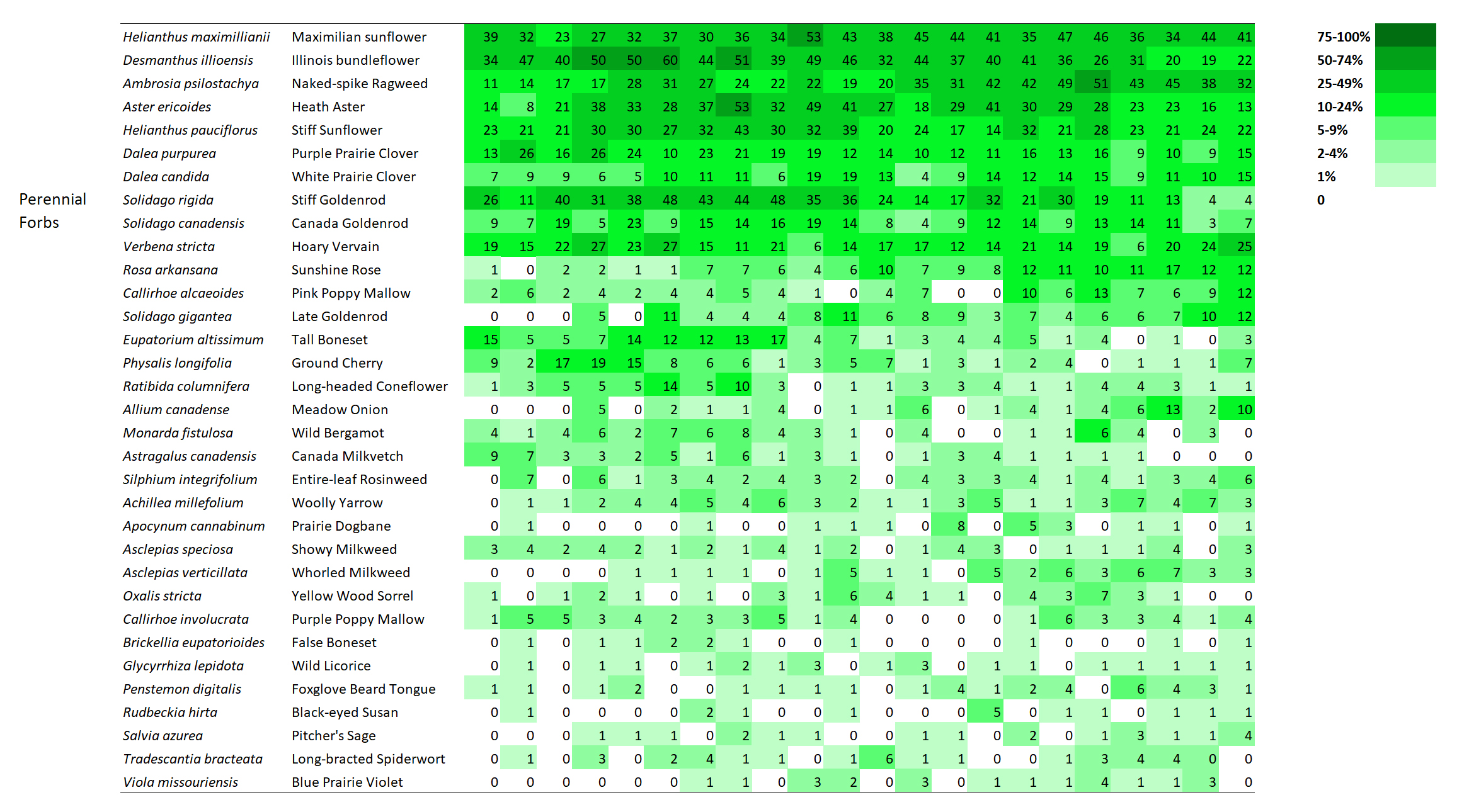
I don’t see much drama happening within the perennial forbs at this site. That’s pretty reassuring, actually, given the kinds of stresses that the prairie has experienced. It’s been managed with patch-burn grazing or open gate grazing since 2002, when this data collection started. As a result, the plant community has been exposed to fire, season-long intensive grazing, and multi-year rest/recovery periods. On top of that, of course, are the wet and dry years that can also significantly affect the growth and survival of plants. It’s good to see that none of these species seems to be disappearing (which also matches up with my other analyses of our restored prairies).

The only species I see that seems to show a significant trend toward lower abundance is tall boneset. That’s not a species known to be particularly sensitive to grazing pressure, as far as I know. In fact, I think of it more as a plant that does well with the kind of lower grass dominance that comes after a bout of grazing.

My best guess is that tall boneset is a species that started out very abundant because of both lots of seed in the mix and a slow, weedy early establishment period for this planting. Over time, it might just be dropping in abundance because it’s not as competitive in this soil type when competition from its neighbors is stronger. I’m just guessing here, though. The point is that the graphic helps me identify this pattern and ask questions!

Short-lived plants and their frequency of occurrence through time.

Within the annual and biennial plants I included, it’s fascinating to see how volatile their frequency of occurrence can be from year to year. I don’t see any species with a decided trend – the species seem to just bounce up and down. What’s most intriguing to me is that all the bouncing doesn’t seem to be synchronized across species. In other words, all these short-lived plants are responding to different stimuli as they increase and decrease in their abundance.

SITE 2 – Dahms 2000 Prairie Restoration. A 69 acre mesic prairie on sandy loam soils planted over the winter between 1999 and 2000.

Now, let’s look at the second site (the one shown in the photo at the beginning of this post).

The Dahms 2000 restoration was planted with 202 species, most of which have been found at the site. Here is the full graphic for this planting, showing frequency of occurrence data for about 60 of those plant species.

I’ve only collected data from the Dahms 2000 site every other year, so there are fewer columns. Also, the site was only in its fourth growing season when I started collecting data, so we’re seeing more of the ‘early establishment’ phase of this site than we did of the 1995 planting, which was in its 8th year of growth when I first collected data there.

Frequency of occurrence for perennial grasses and sedges, including two invasive grasses.

Interestingly, there is a little more directional change within the grasses at this site than in the 1995 planting. Is that because the data includes earlier periods? Maybe, but even so, the change seems to continue past the first 8-10 years for at least some species. Big bluestem, Indiangrass, short-beaked sedge, and switchgrass all seem to be on trends of increasing frequency. Canada wildrye seems to be going in the opposite direction so it’ll be interesting to see if/where it levels off.

Both Kentucky bluegrass and smooth brome have increased in percent frequency over time. However, as in the 1995 planting, I’m not seeing any negative impacts on species diversity (yet?).

Frequency of occurrence of perennial forbs in this 2002 planting.

Within the perennial forbs, a few species at the top (stiff sunflower, yarrow, and bergamot) seem to be on an upward trend, at least before the last sampling period. You might notice that there are a lot of species – across all the categories – that dipped in frequency in 2023. I’m pretty sure that’s a consequence of thatchiness caused by a recent lack of fire and grazing, which was intentional on the part of the Platte River Prairies preserve manager (a combination of a scheduled rest period and a response to a couple dry years). I’m confident the numbers will bounce back up again over the next few years as the site gets more fire and grazing again.

Apart from those species, I think the most interesting thing about the perennial forbs is the lack of many obvious trajectories. For the most part, species seem fairly stable in their abundance through time, though some ebb and flow in interesting ways. Some species that have been labeled ‘aggressive’ in some circumstances don’t seem to be acting that way here, including Canada goldenrod and Maximilian sunflower.

Frequency of occurrence of annual and biennial plants in a 2000 prairie planting.

Just as in the first site, short-lived plants bounce around a lot in their frequency of occurrence. The variation over time is evident even though the data was only collected every two years. Once again, I don’t see much synchrony within those bounces, which tells me each species responds individually to the myriad stresses applied to the site over time. Fascinating!

So, there’s my attempt at a visual display of plant community change in our restored prairies. Does the approach seem helpful? Suggestions for improvement? Ideas for what to name the graphics?

.

And now, for those of you hoping to see pretty pictures, here are three photos of ice bubbles from a restored wetland at the Platte River Prairies last week. Enjoy!

Just When I Think I’ve Got Something Figured Out…

I pay close attention as I walk through prairies.  I watch for tracks to see what animals are around and I notice which flowers are blooming and which insects are feeding on them.  Often, I notice changes in prairie plant communities and try to attribute them to our management treatments, weather patterns, or other factors.  Observations such as these are an important part of how I learn more about prairies and adjust the way we manage and restore them.

Observations are a critical component of understanding natural systems and how management and restoration actions affect them.

Careful observation helps ecologists and land managers understand how natural systems work and how they are impacted by management actions.  However, observations are tricky because they provide an incomplete picture of what’s happening and are influenced by personal bias.

Unfortunately, observations are inherently biased.  When I start to notice a pattern through observation, I construct a theory to explain it.  That’s good science.  However, once I have a theory in mind, it influences the way I see things – and I tend to interpret my observations based on my theory.  That means it’s pretty easy to start telling myself a story that sounds good, but isn’t actually true.  Sometimes, I figure out that my story is wrong through repeated observations.  More often, however, what causes me to stop and reconsider is cold hard data.  Here’s a recent example of my data showing me that I need to reconsider a theory based on observations.

Canada wildrye (Elymus canadensis) is a native cool-season grass that establishes very quickly from seed in our prairie restoration (cropfield conversion) work.  It is often very abundant during the early years of a seeding before settling down into the plant community after a few years as other prairie plants become more dominant.  A common complaint from those working with Conservation Reserve Program (CRP) or similar prairie seeding projects is that wildrye tends to disappear a few years after planting, leading people to question the value of including the species in the seed mixture.  However, in our restored prairies, I’ve observed that while Canada wildrye declines in abundance after the initial establishment phase of a seeding, it seems to persist pretty well at a moderate abundance from then on.  I’ve attributed that to our grazing management, which is partially aimed at periodically decreasing the vigor of dominant grasses.  Weakening dominant grasses should help prevent less dominant species such as Canada wildrye from being pushed out of the community altogether.

Canada wildrye  is a native cool-season grass that is common in our restored prairies.

Canada wildrye is a native cool-season grass that is common in our restored prairies.

So, my theory (which I’ve shared with many people) has been that Canada wildrye is a grass species is tied to disturbance regimes.  If a prairie is managed with a mixture of intensive grazing periods and rest periods, wildrye can sustain a fairly steady population.  It was a good theory, and seemed to fit my observations.  Until last week, I was pretty happy with it.  Then I looked at some recent data.

One

These data were collected from about a hundred 1 meter square plots across a prairie.  Each time I laid down the plot frame, I listed the plant species found within it.  By looking at the data from all of the plots, I can calculate a frequency of occurrence for a plant species (the % of all plots it was found in).   The data in this graph were collected from a restored prairie seeded in 2002.

.

Two

These data were collected from a restored prairie that was seeded in 2000.

.

three

More data – this time from a restored prairie seeded in 2001.

From looking at the above three graphs, you might conclude that Canada wildrye populations stayed high for the first eight or nine years after planting a restored prairie and then started to taper off.  Another interpretation might be that our grazing was able to prop up those wildrye populations for a certain amount of time, but it is now starting to suffer the same fate my colleagues have complained about in CRP plantings.

Now, consider this next graph.

four

This graph shows data from the same 2002 planting as shown in the first graph (red lines in both graphs).  In this graph, however, the orange line is data from a large exclosure at the same site that has been burned but never grazed.  The two blue lines are from a different restored prairie seeded in 1995.  The dark blue has had fire and grazing management since 2002, while the light blue line is from a large exclosure at that site that has never had grazing within it.

By looking at the red and orange lines you might conclude that grazing management had a strong negative impact on Canada wildrye in the 2002 planting between 2011 and 2013.  The lines from the grazed portion of the site (red) and the exclosed portion (orange) are heading strongly in opposite directions.  However, the site was also grazed in 2008 and 2009, and there is less difference between grazed and exclosed in those years.  In addition, the blue lines on this graph show data from populations in a different nearby restored prairie (seeded in 1995) which don’t seem to be strongly affected by whether or not they are grazed.  There is less wildrye in the ungrazed exclosure of that 1995 planting but the changes in frequency seem pretty similar between the grazed and ungrazed areas.  Hmmm…

five

This graph shows data from two of the sites shown earlier (2000 and 2001 plantings) as well as another nearby restored prairie that was seeded in 1999.  Despite very similar management regimes, the 1999 restoration seems to be maintaining a high population of Canada wildrye.

This last graph just muddies the water even more.  While populations in the 2000 and 2001 restoration seem to be declining over time, wildrye frequency in the 1999 restoration has been holding steady for 15 years.  All of these sites are within a mile or two of each other, were planted with the same kinds of seed mixtures and have been managed with very similar mixtures of periodic fire, intensive grazing, and rest (modified patch-burn grazing).

It’s possible that soils play a role in the differences between sites, but all the prairies above are on similar alluvial (river deposited) soils.  None of them seem all that different from each other (I need some data on that!).  Weather could also be a factor, though most of the declines seemed to start around 2008 or 2009 – a few years after a long drought period – and have continued through both wet and dry years since.  I’m not sure what weather factors might have popped up since 2009 that would cause a decline in wildrye abundance (and only at some sites).

Surprise!  Reality is more complicated than a simple cause and effect relationship between a management regime and a plant species…

I take two major lessons from this.  First, I need to be more careful in my assumptions about how our management is impacting prairies.  That’s nothing new – I fall into that trap all the time, and frequently have to remind myself not to overgeneralize.  In this case, I had constructed a logical story explaining why Canada wildrye was abundant in our well-established (old) restored prairies but rare in ungrazed plantings such as CRP fields.  There are, of course, many possible explanations for that phenomenon (differences in soil types, plant diversity, seeding rates – particularly of warm-season grasses, fire management, etc.) but I grabbed one simple explanation without adequately considering all those other factors.

The second lesson is that it’s dangerous to rely solely on observations when trying to figure out natural systems.  This is not a new lesson either, and it’s why I try to collect as much data as I can.  Observations are really important, but are easily biased by what we think is – or should be – happening.  It’s natural to see what you expect to see.

Collecting some unbiased data, even just a little, is well worth the effort – especially if you target the data collection to your objectives.  It’s not useful to just collect data for the sake of data, but if you have a specific question (“are we maintaining diverse plant communities in our restored prairies?”) data can help answer it.  I consider plant community data collection to be a very important part of my job, but it doesn’t actually take that much time.  It takes about a day per year for each site I sample, including data collection, data entry, and analysis.  I strongly encourage every land manager to collect some kind of data from their sites.  It doesn’t have to be complicated or time consuming – just something that can help evaluate how management treatments are working.  Observations are great, but unbiased data is a good way to make sure you’re telling yourself (and others) the right story.

I’m not sure what to think about Canada wildrye now.  It’s a little disappointing to find out that my story was wrong – or at least incomplete.  On the other hand, the complexity of interactions that apparently drives Canada wildrye populations are why I love prairies and prairie management.  If it were simple, it’d be boring.

And no one likes a boring story.