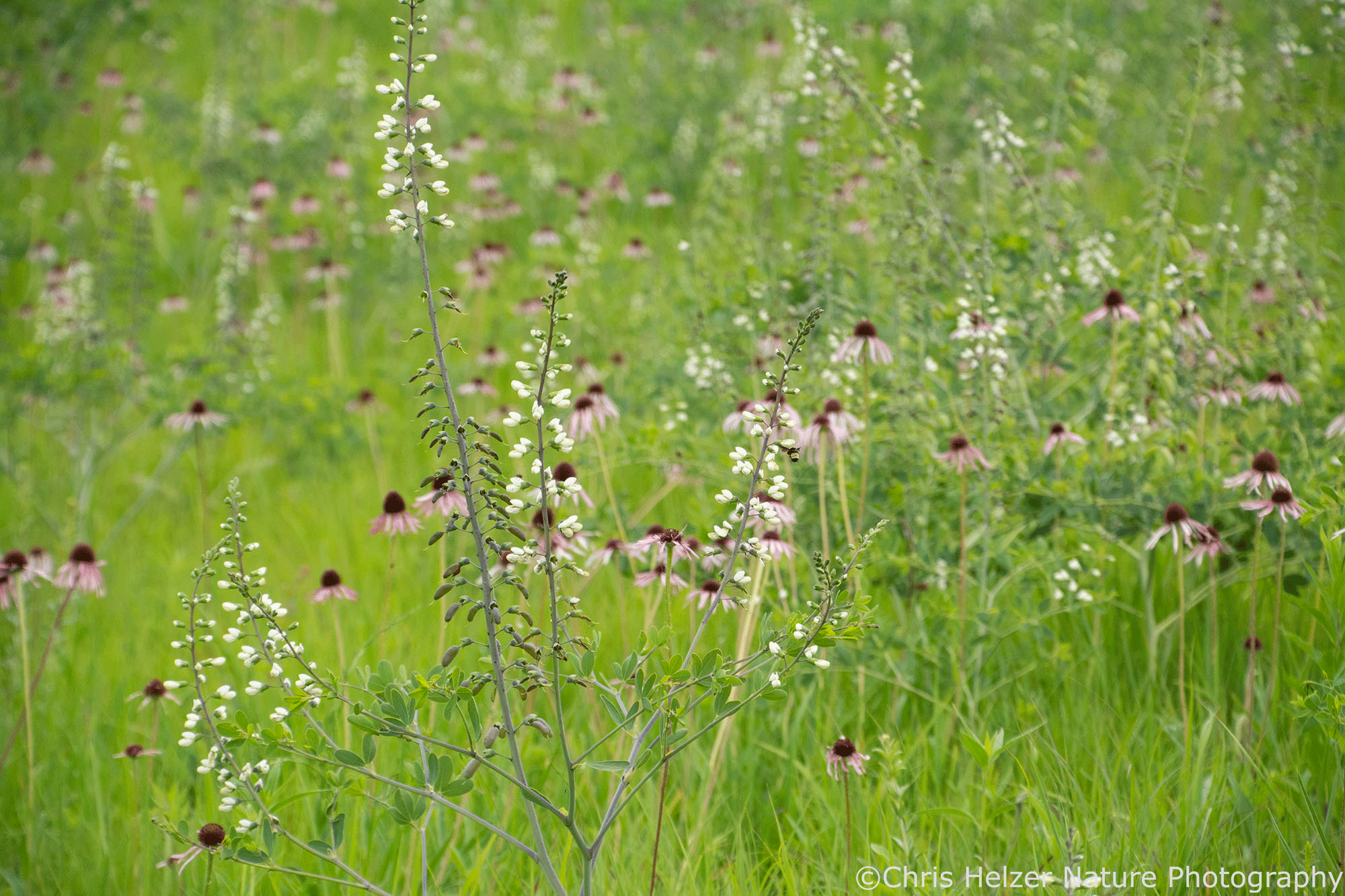
Does this look like a high-quality prairie?
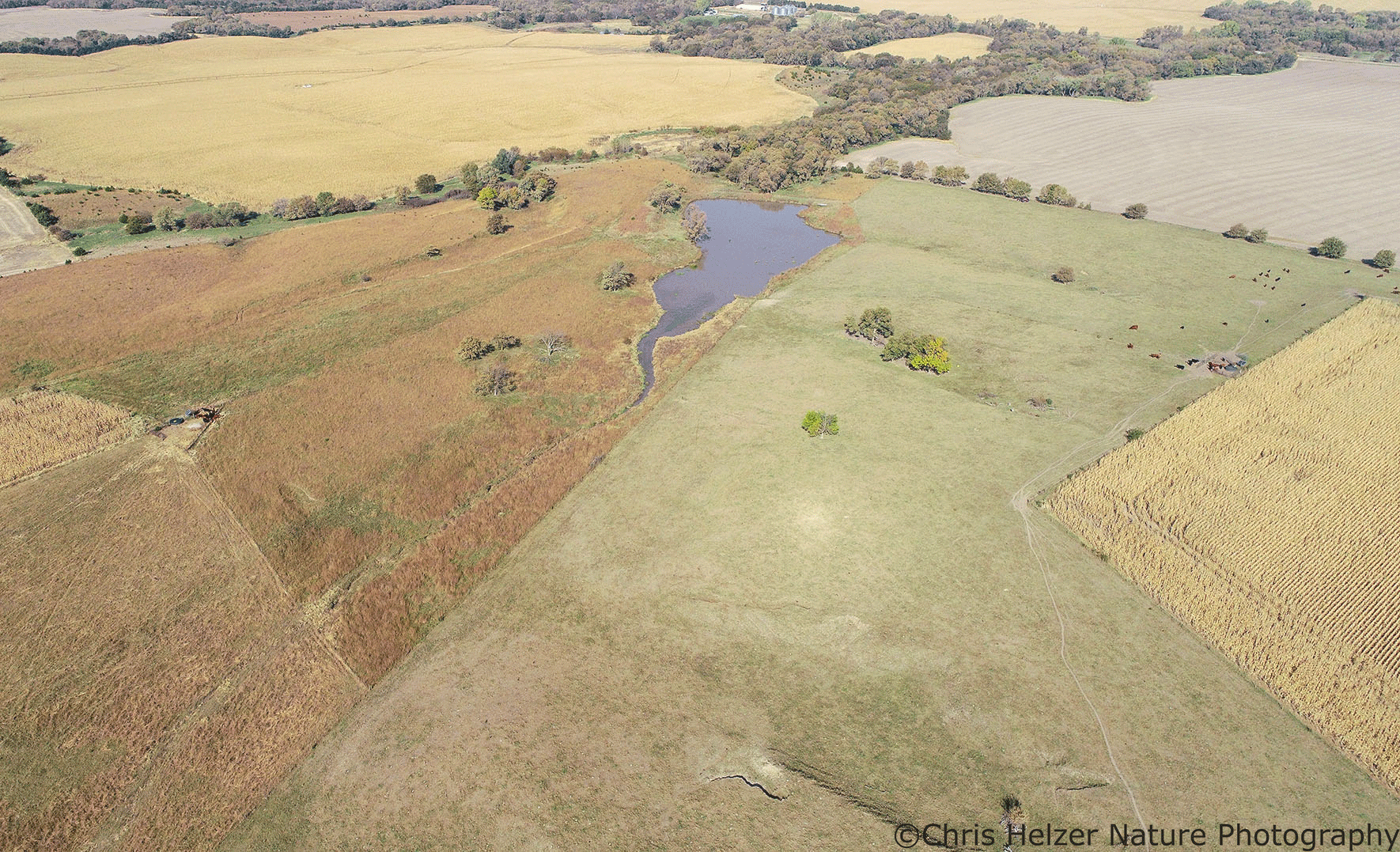
What about this one?
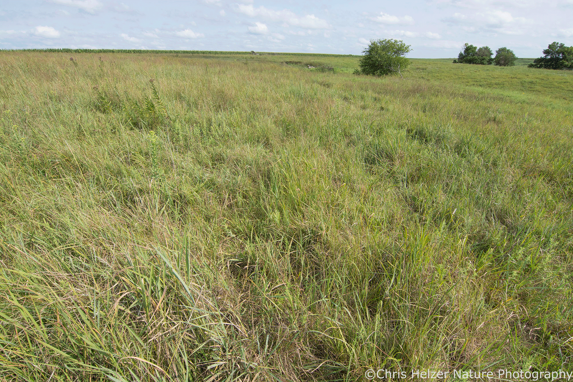
What if I told you the first one was 2 acres in size and the second was part of a 20,000 acre grassland block?
Would it affect your opinion if you knew the first site was isolated from any other prairie habitat by miles of cropland and was directly adjacent to a busy highway? What if I told you the second prairie hosts three different prairie dog towns and a herd of bison?
(None of this is true, by the way. These are just hypothetical statements meant to be thought-provoking.)
The term “high-quality prairie” is often used in conservation circles, but people have very different definitions for it. That’s not necessarily a bad thing. In fact, it’s fascinating to see how the quality of a prairie is defined by people in different parts of North America, let alone in other parts of the world. The cultural context is incredibly important to the way prairies are assessed and appreciated.
Here’s another example.
Does this look like a high-quality prairie? Would it change your opinion if you knew it was planted on former row crop land?
Taking that further, does it matter if that restored prairie is about 10 acres in size and not connected to any other natural areas? In contrast, what if it was 50 acres in size and connected two formerly-isolated remnant (unplowed) prairie parcels together? Does that affect its quality or value? Does it affect the quality or value of those remnant prairie parcels?
What are the criteria we should use for evaluating prairies?
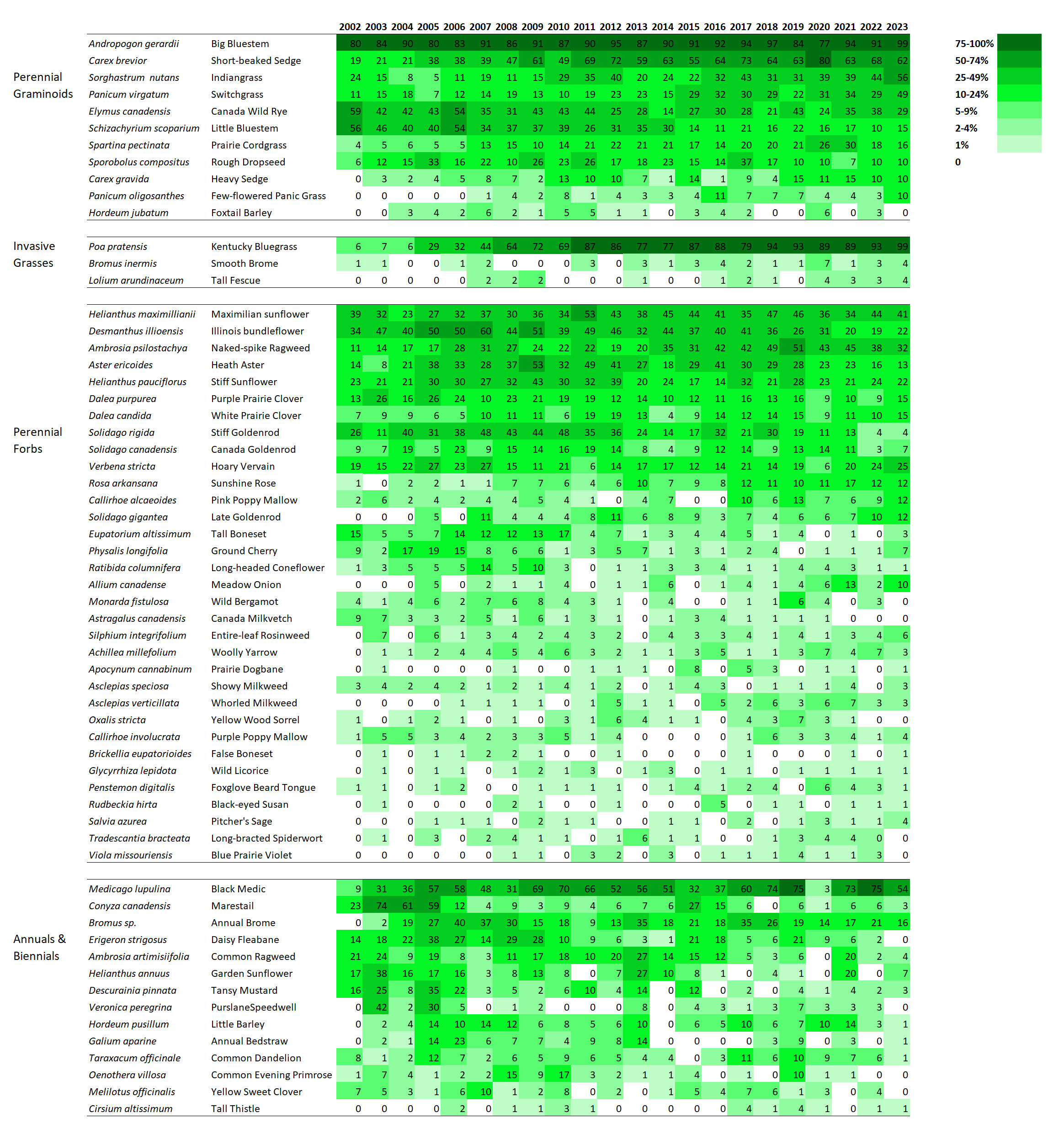
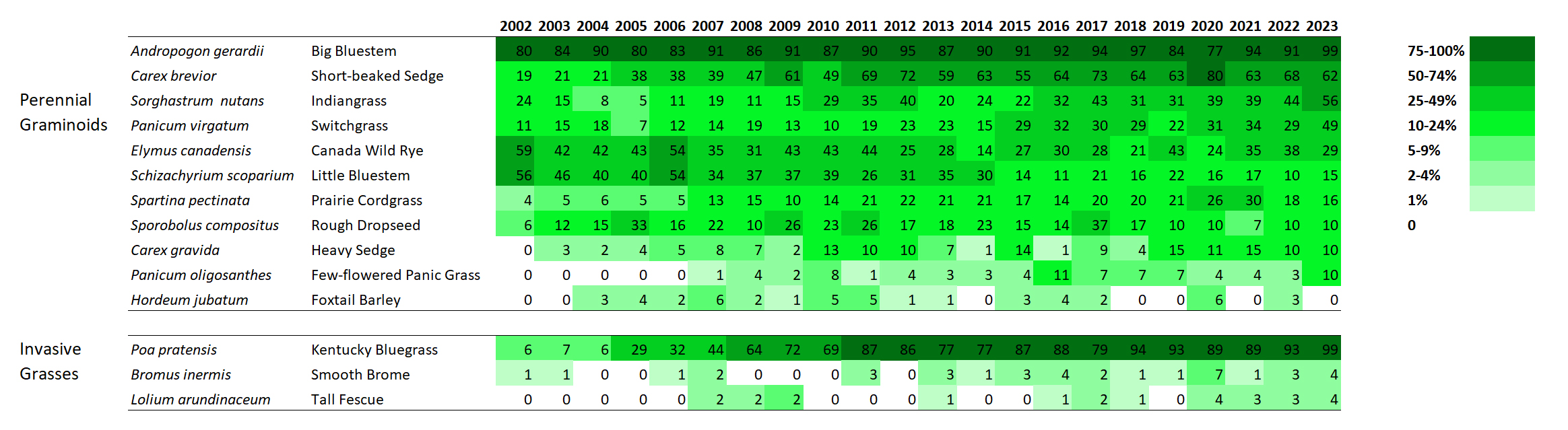
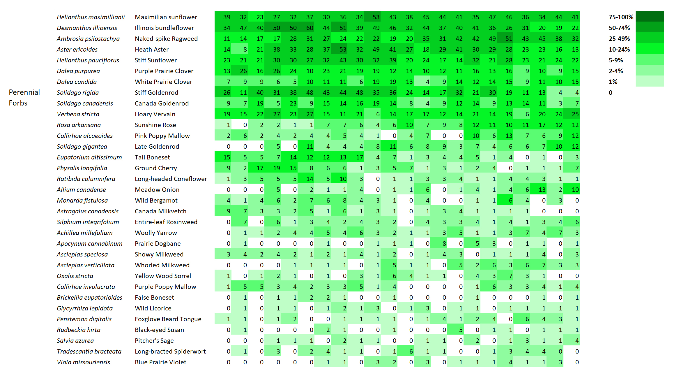
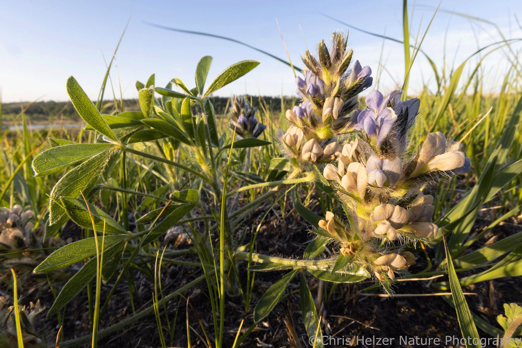
A very common way to assess prairies is by looking at their plant species. That makes good sense. Prairie plants are beautiful. In addition, of course, the plant community has a huge influence on the other components of the larger prairie community, including animals, fungi, and other soil microbes. Maybe more importantly, you can always find plants. They are literally rooted in place.
When you visit a prairie, you might not see a pocket mouse, a katydid, or a badger, but if there’s a population of stiff sunflower, you can go to a particular spot and see it – it might even be in flower if you time it right. Over time, it’s easy to see how that population is doing because you can check on it whenever you want.
There are multiple ways to evaluate a plant community. The diversity of species is usually considered to be one important factor. The presence of rare plant species, or species that have very specific habitat or management requirements, can be another. The second can be particularly significant in landscapes where very little prairie is left. Finding a prairie that still hosts rare plants is a big deal.
Looking at the diversity of plants and the presence and abundance of rare species is a very sensible way to begin evaluating a prairie. I often do it myself. You can visit a prairie at any time of year and make at least some assessment of the plant community – though it’s much easier during the growing season.
In contrast, you have to time your visit carefully if you want to see what the bird community looks like (many species are only present for a few months each year). Small mammals are tricky because they’re hard to see and you probably need some kind of trap system to even find any. You can see a lot of invertebrates if you look closely, and of course you can pick up a sweep net and very quickly gather a bunch of them to inspect. But invertebrates are notorious for having massive swings in population size from year to year, and many are only aboveground for short periods of time each season. That means it can take a lot of time and a lot of effort to get any picture of what’s happening with invertebrate communities.
However, notwithstanding the challenges of evaluating their populations, birds, small mammals, and invertebrates are all important components of prairies, right? Any assessment of prairie quality should probably include them – not to mention reptiles, amphibians, large mammals, fungi and other soil microbes, and lots more.
Looking at the plant community can provide hints about some of those other organisms. Plant diversity is strongly correlated with invertebrate diversity, for example. However, not all prairie animals have such strong ties to the diversity of a plant community, or to the presence or absence of particular plants.
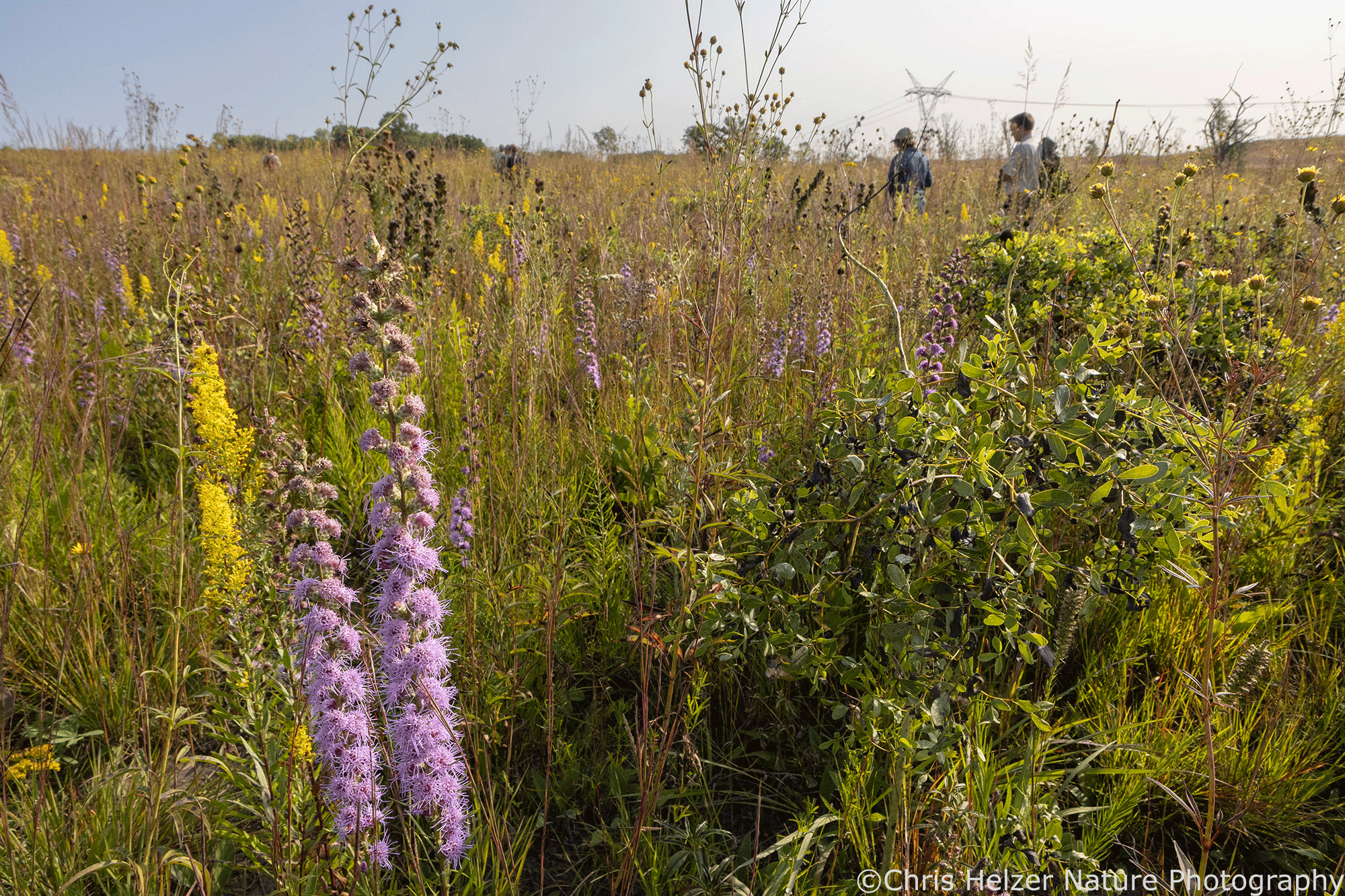
Most grassland birds, for example, are really dependent upon the size of a grassland area and the habitat structure present. Some species nest in short grass, others in tall. Still others need a variety of habitat patch types because they use different vegetation structure for nesting, brood rearing, wintering, and/or courtship displays. In addition, a lot of grassland nesting birds are sensitive to the size of a prairie and/or won’t nest near wooded edges, roads, etc. (or suffer poor nest success when they do).
Small mammals, reptiles, and invertebrates also respond strongly to the kind of habitat structure in a prairie. Just as with birds, each species has its own preferences or requirements – some looking for short/sparse habitat, others for tall/dense cover, and some need something in the middle or a mix of all of those options. Also, like birds, many of those animals and their populations will thrive best in larger prairies than in smaller ones.
So, in addition to a “good” plant community, you could argue that a high-quality prairie should also be one that is large and managed in a way that provides a mixture of habitat structure. Maybe, but this is where things get really interesting.
In many places, large prairies just don’t exist anymore. We’re left with small remnants of grassland, surrounded by row crops, urban areas, woodlands, or other land cover types. Does that mean none of those prairies are high-quality? Of course not. But the context matters. The quality of a site is measured against objectives (what do we want a prairie to be or to provide?) and objectives are informed by local culture.
Small prairies can still provide excellent habitat for many species, including plants, invertebrates, and many small vertebrates, though stewardship gets really tricky. It can be really challenging to manage those sites in a way that doesn’t eliminate any animal populations (by repeatedly burning the whole site, for example) while still staving off woody plants and invasive species. However, when comparing a bunch of small prairies to each other, we can come up with criteria for determining which are higher or lower-quality.
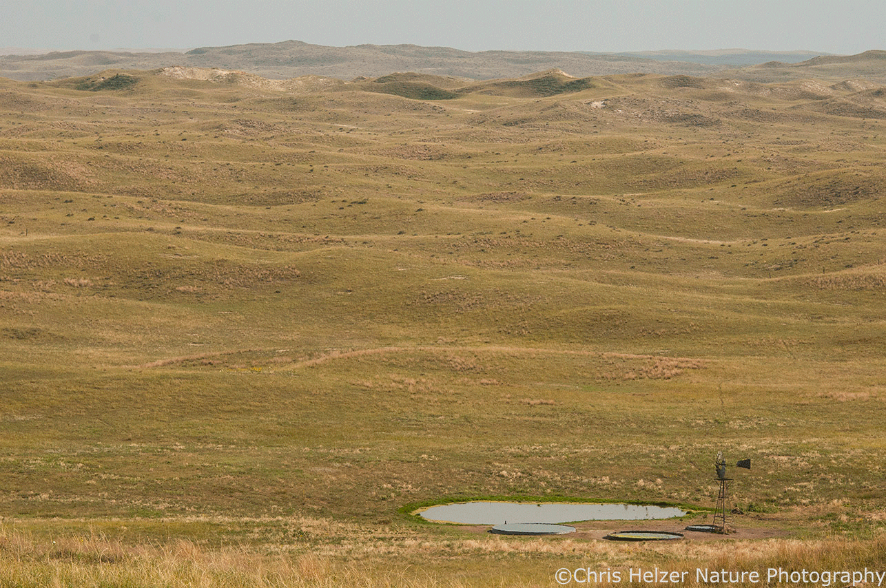
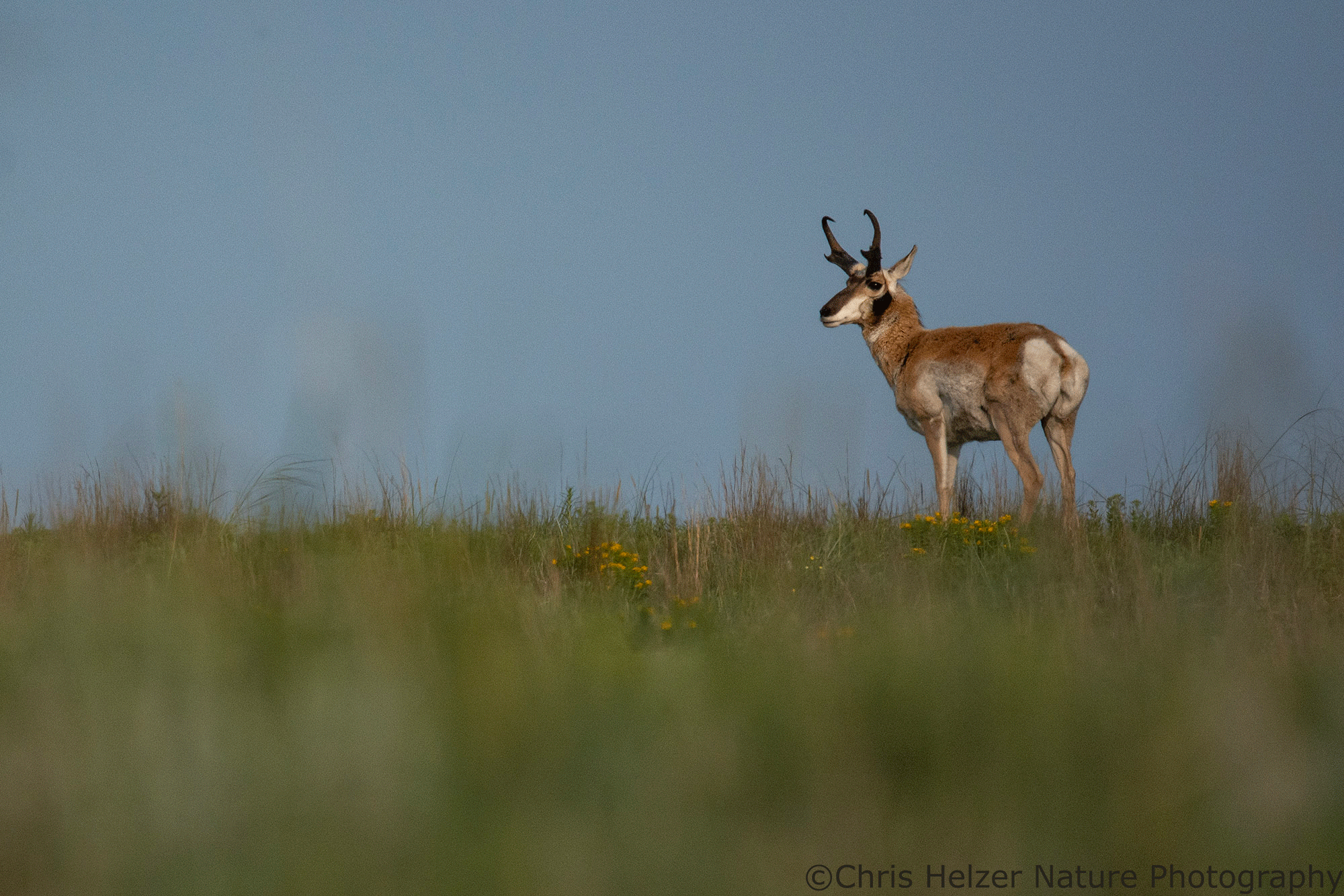
On the flip side, there are parts of the world where we still have huge, unplowed grassland landscapes. These prairies have the scale to support a lot of animals that can’t survive in isolated small prairies, and – if managed appropriately – the habitat structure those species need as well. That might even include many large animals like bison and pronghorn, or other charismatic species like prairie dogs or prairie grouse.
However, in some of those landscapes, much of the prairie has lost plant diversity and/or populations of plant species that used to be there, and that has big implications. Not only is the plant community an important component of “quality”, it also supports many of the other organisms that make up a strong, resilience grassland community. Scale and habitat heterogeneity can make up for some of that, but species diversity is also a huge component of resilience.
Looking across a landscape like this, with lots of grassland but varying degrees of plant diversity and other components, we can pick out places that we think are of higher quality than others. The criteria we use to make those decisions, though, will surely be different than the ones we use in a landscape where only small prairie patches remain.
Here’s why all this matters:
All of us who live around and work with prairies evaluate them through our own lenses. Some of the criteria we use are shared, but others are heavily influenced by local conditions. That’s ok, but we should recognize the biases we each have. More importantly, we should make sure we’re talking to and learning from each other.
About 15 years ago, I wrote a post about these different views on prairie quality. In that post, I talked about how some of us focus a lot on the species composition (mainly plant composition) of prairies, while others look more at habitat structure and processes. Those tendencies tend to be correlated with geography (east/west) and with the amount of grassland remaining in landscapes.
In that post, I was hoping to stir people to expand their definition of prairie quality and to borrow perspectives from others. There’s been some movement in that direction, but there are still some big differences in the way people assess prairie quality, and that strongly influences the way those prairies are managed.
As examples, I would love to see people working in fragmented prairie landscapes think more about how to vary habitat structure across even relatively small prairie parcels to benefit invertebrates and larger wildlife species. At the same time, I wish people in landscapes with much larger prairies would pay more attention to plant composition. While we have extensive prairies where the plant communities are in terrific shape, there are also lots of places where plant diversity is relatively low and many plant species are hard to find.
There are lots of ways to create more heterogeneous habitat structure in prairies – even small ones. We also have ways of managing for, and even rebuilding, plant diversity in places where it has diminished. Good, creative land stewards working in today’s grasslands should be able to do all of that. However, we aim our stewardship at the goals we set for ourselves, and those goals are tied to the way we evaluate prairie quality.
It doesn’t make a lot of sense to compare a 10-acre prairie fragment in northern Illinois to a 5,000-acre prairie pasture in central Kansas and argue about which is better. It’s ok to say both are high-quality prairies (or not), based on local criteria. What’s crucial is that we continue trying to learn from the way we each see and value our prairies. All of us can benefit from expanding our perspectives, right?