Here’s a photograph I took a couple years ago while hiking at Griffith Prairie – a site north of Aurora, Nebraska that’s owned and managed by the Prairie Plains Resource Institute.

Setting sun at Griffith Prairie – Hamilton County, Nebraska.
I like the image, in part, because it shows what that evening looked and felt like as the sun dropped to the horizon. What you see in the photograph is pretty much what my eyes saw. However, it does NOT look like the image that came out of my camera. I had to use image-processing software to alter the image so it looked like it did in real life.

For this image, I adjusted my camera’s settings so that the grass would be correctly exposed (not too bright or dark), knowing that the sky would be overexposed (too bright).
A camera’s sensor makes photographs by capturing reflected light from a scene. However, a sensor is not able to record the same range of light (from bright to dark) as the human eye. The same is true with film. That means that in the above image, although my eye could see all the colors and details in both the sky and the ground, the camera was unable to capture both. Either the sky was going to be bright and washed out or the ground was going to be way too dark. Neither of those was an acceptable option to me.

In this photo, I set the camera to capture the sky as it looked to my eye, knowing that the ground was going to be very dark.
I ended up shooting the scene a couple ways, figuring I’d try to fix it later. I later used the second image (the one with the really dark ground) as a starting point and used Adobe Photoshop to lighten the ground and bring out the details and colors my eye saw but that the camera couldn’t capture. There are two ways to look at this. The first is that I used the tools at my disposal to make the image match what I saw in real life. The other is that I essentially lied to you by altering the image that came out of the camera.
If you don’t like what I did and feel like I lied to you, consider this… Nearly every photo you’ve seen in any printed form has been manipulated, regardless of the era it was printed in. Old time black and white photographers spent hours adjusting the tone of various parts of their photos as they created prints. When you take a roll of film or a batch of digital photos to get printed, the printing machine makes automatic adjustments to the images as it prints them – or the technician can override those with his/her own adjustments. There is really no escaping the fact that photography is art, and that much of the artistic interpretation takes place after the photo is taken.
While photography is art, I’m a scientist trying to share my experiences in the natural world with others, so I feel an obligation to represent things accurately. That puts me in an interesting position. Do I avoid processing photos in order to show the viewer exactly what my camera captured – even if that image doesn’t accurately reflect the image I saw in real time? Or do I manipulate the photo to make it look like it did in real life, even if that necessarily means I’m putting my own translation of reality into that image?
I’m not sure there’s a right answer, but I generally choose to process images and attempt to show you what I saw through my eyes. I want you to see the same prairies I see in the hope that you will better understand and appreciate them.
Here’s the final version of the image one more time. Do you like it more or less, knowing what went on behind the curtain?
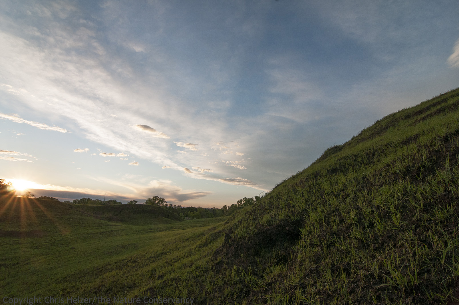
This is the same image of Griffith Prairie shown at the beginning of this post.

