I’m putting together a collection of my favorite photos from 2013 for a “best photos of the year” post similar to the one I did last year about this time. It’s been a tough task, especially when there are two photos that are only slightly different from each other. I’ve gotten through most of them, but am stuck on one pair of photos. Since I can’t seem to make a decision, I’ve decided it might be fun to just put it to a vote.
I’ve put both options below. If you have a preference between the two, let me know by replying in the comments section below.
The image that gets the most votes will be part of the photo collection next week.
Thanks for your help!
Photo A: (you’ve seen this one before)
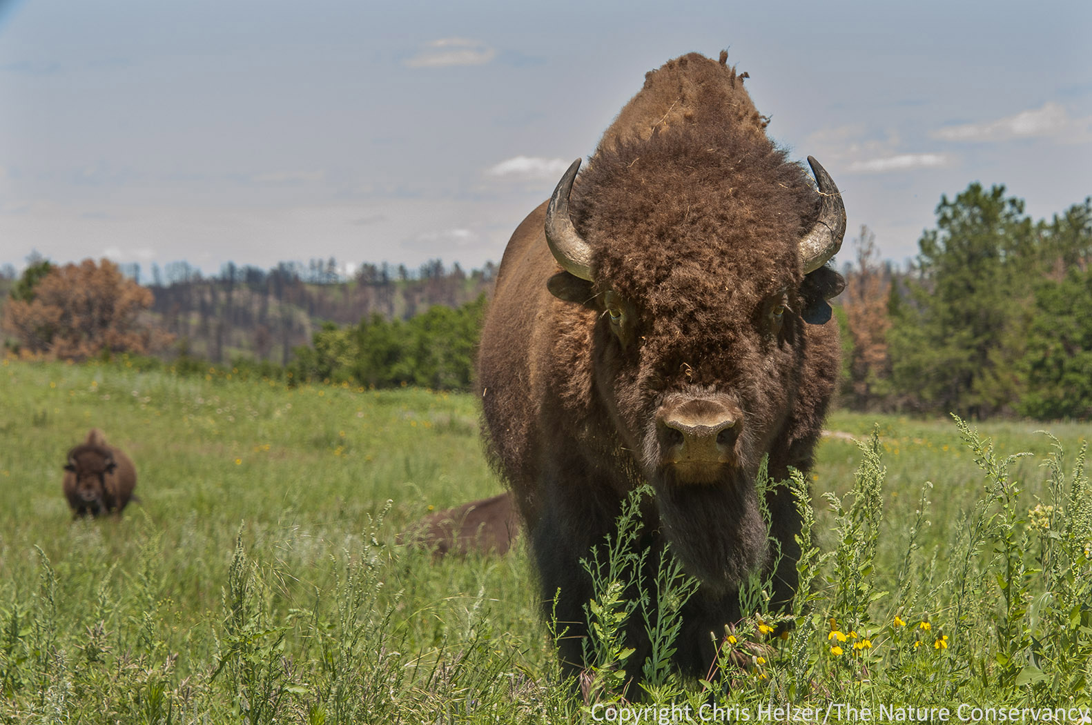
Bison at The Nature Conservancy’s Niobrara Valley Preserve (one year after the big wildfire).
.
Photo B: (taken just a few seconds after the first)
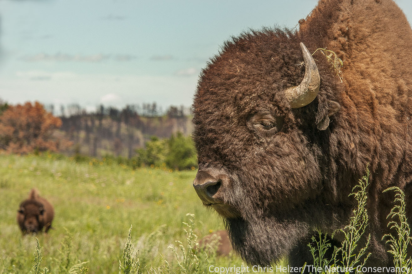
The same bison, different angle. (Both photos were taken from the safety of a pickup.)
You can click on each photo to see a larger and sharper image of it. Please vote – and thanks for your help!

I prefer the second photo – with the side view of the bison’s head
B
Photo A, because you clearly captured both of the eyes. I’ve been taught that when it comes to wildlife photos, “the eyes have it”.
Casting my vote for Photo B. Both are nice shots!
Sent from my iPad
Photo A has a slight edge in composition, but both are great.
This is exactly what I was thinking. Saved me from scrolling all the way to the bottom of 90 comments. :)
B
Vote for B
Photo B it is!
Both outstanding, but cast my vote for Photo B. Like composition.
photo B!
B
My vote is for B
Completely understand the dilemma. I’m leaning towards B because of the completely whimsical flower stem behind his or her ear. It cracks me up :)
I vote for A.
Photo A. I like the composition- because it’s not all about the bison. Its about green grass, a burned hillside and tells a better overall story of fire recovery.
Photo B because I like the close up side view of the bison.
I like B. you capture his essence and then your eye is drawn, because his head is turned, to the great stuff going on behind.
Definetely B. Both are nice shots. I noticed the Stipa and the Yellow Coneflower in A, but the head-on view of the bison is more standard or traditional. Whereas the close up side view of the bison’s head in B. draws you in more, especially since you can see more interesting details like the bits of plant material by the horn and the texture of its hair. B also has stronger aspect for fore ground (the bison’s head)/middle(the other bison)/back ground (the burnt hills).
I like the first a lot more. It’s a more intriguing shot of the bison itself, and as another poster mentioned, the composition also seems better.
Photo A.
Definitely Photo B.
Diana Rankin Brook Park, MN
Photo B
Photo B – more personality depicted.
I believe I like photo B the best. It seems to capture more, in my opinion, of the bison’s personality.
Both great shots. I prefer the composition and color in the first (A).
A has been on my desk top back round since you posted it earlier. I am picking A. That and she just looks like she lost her best friend in B.
Vote me with Karen. So forlorn. The Eeyore of bisondom.
Photo B… tough choice!
B!
Sent via the Samsung Galaxy S™ III, an AT&T 4G LTE smartphone
The first definitely has by far the better composition and drama. The second one mostly is just good for some of the detail that one ordinarily does not see in a bison photo. So #1 would get my vote, hands down.
Both are fab. I have a copy of the first one hung so that I can see it from my computer. I go with the 1st one. You captured the essence of this habitat in years gone by.
Joan
From: The Prairie Ecologist <comment-reply@wordpress.com> Reply-To: The Prairie Ecologist <comment+eivbjm5me6cz7o_qtfyp5ih@comment.wordpress.com> Date: Thursday, December 12, 2013 7:44 AM To: Joan O’Shaughnessy <joshaugh@chicagobotanic.org> Subject: [New post] Choices, Choices.
Chris Helzer posted: “I’m putting together a collection of my favorite photos from 2013 for a “best photos of the year” post similar to the one I did last year about this time. It’s been a tough task, especially when there are two photos that are only slightly different from “
There certainly is a dilemma here. The first photo seems the more artistic, and the second more interesting. I’m going with interesting. I really enjoy having a closeup of that head.
Photo B…both are terrific as others have noted. It is a hard choice, but the detail in the 2nd photo and the fact that it is different than the traditional heads on angle makes it edge out the other photo. Thanks for sharing your talent and for working so hard to preserve these wonderful beasts and the gorgeous Sandhills.
I generally think close photographs are overused at the cost of a better understanding of the object but B has it for me, I love the nose.
Looks like there’s a real division of opinion here! Both are great shots, but my vote goes to A.
These images are similar, and yet so very different. I prefer the first, partly for the composition, but I also prefer the story that the first puts to my mind. The emotions each stir (and the personification these emotions evoke) are strikingly different. In the first, I see two powerful protectors, willing to battle any creature foolish enough to try to damage their prairie home. These bison are strong and will face their many problems head-on. In the second, I see the downcast eye and wonder if the bison is about to cry (was Eeyore a bison and not a donkey after all?). I see sorrow for all that has been lost and all that is vanishing before their eyes. These are both tremendous oversimplifications of my thoughts, and both are a part of the prairie story. But I choose to be the optimist and stick with image A…
Yep, Photoshop a tear flowing from that eye and you have the bison equivalent of the Native American chieftain in that 70’s public service announcement crying over the polluted river. On the other hand, with the exception of the weed stuck in her hair, she looks like she just returned from a trip to the groomer. Nothing to be sad about there. Perfectly sculpted. A good hair day!
Photo B
Photo A. Easy choice.
version A
B
I also go for Photo B
Photo A. I like the balance of it. :)
Photo A because of the grass and sky colors.
Now what would really be impressive (but not smart) is taking it with a 10mm lens!
Think you added more controversy for yourself.
I vote for A
They are both wonderful… but I’d have to say photo A.
Photo A
No deciding! Just a comment about the difference between exceptional artistry and exceptional ecological story telling. Merry Christmas.
Judging from previous comments, B seems to have it but my vote is A. I like side view of B better but the vegetation in A tells me a lot more about recovery, That’s the prairie/range biologist in me, I guess. Glad you mentioned that you were in a vehicle because that is one of the things that crossed my mind–long lens or safe vehicle?
I prefer A! There are few things both so intimidating and inspiring as a bison staring you down. Glad you were in a truck!
B
both fabulous but I’d go for B as I like the close up detail of the woolly coat, also proportionally he (must be a he, right?) fills more of the frame which I think makes a better composition.
I vote A. B looks bummed out.
Well Chris what a conundrum you have here.
Do you have a limit on photos and if not why not both? Each one is great for different reasons and who will lose if you don’t decide to cull one or the other but if you have to get rid of one I vote for A as it is a better overall image than B, more of a story I think and when you blow them up it has more POW! value.
Definitely the side view bison in the foreground.
Photo B – I like the composition better than A. Photo B conveys the massiveness of the bison head and still you see about the same amount of prairie.
Chris–just a treat to enjoy your photography. Thank you. They are both great shots and both great exposures–the bison have detail and are not just blobs of brown. If forced to chose, I would go with B, because the reclining bison behind the key subject keeps dragging my view away from the foreground.
I love both pictures but the one that sticks with me the most is A. I love the side view with a little closer up but photo A evokes the semi-menacing/dangerous nature of the bison bull. He has that look that says “what are you looking at puny human?”. The side view is great but doesn’t have the same attitude.
Thanks for sharing!!
My vote definitely goes to B. Talk about a Wow effect!
B. I love your blog, and your photos are such a treat.
Easy choice. Love pic #1.
Photo A
The bison in A tells me “Don’t come any closer or I will flatten you.” The bison in B says “Come on over and scratch my back.” Photo A tells the true story and has my vote.
Photo B prairie & bison are massive
I think the choice of photo depends upon the usage. As others have commented, compositionally Photo A is a nicer capture. It conveys more about the big picture (bison, prairie, fire). I think photo A is a better choice for larger formats (i.e. a calendar). Photo B has better lighting on the main subject, but too closely cropped for general use; and it’s always better when the animal your photographing is not staring directly at the photographer. Photo B would be a great choice for a small image on a webpage discussing bison. I give Photo A the edge, but both are nice shots!
Something of the wisdom of Solomon here. I change my vote to both. If possible.
I will be the one who will be the opposite of everyone else. I like the profile picture the best. Why? in the background you can still make out the burned area. With the angle it appears the bison is looking at that in the distance. The close-up of the bison is phenomenal. The details are sharp and let’s face it, they are truly magnificent animals.
My two cents!
vote for #1!
B
A
Photo A
a
chris – both nice photos; however the 2nd photo gets my vote. Although no eye to eye contact with either photo, the Bison in the 2nd image has some unique….a magical tuft of grass in its horn that tells a story on to itself! Every neat image needs some small extra that makes the eye work the entire photo.
Congrats – these along with what you have sent out over the year are most inspirational!
Thank you,
Bruce Jones
Another vote for A!
Photo A for sure! it shows the flowers in the foreground, the pines in the mid, and the burned woods in the back are more in focus than the second one. overall a more complete story.
use ‘b’oth ….
Vote for B.
Tough choice, but my vote is for A. Your photos are a real treat.
I like both, but B reminds me of an old uncle of mine. Gotta love it!
I vote for #2 — the profile shot. I like the composition and I think the side view is much more evocative.
Thanks for all you do — I live in a forest on the west shore of Puget Sound (in Washington, the state) — far from my beloved Nebraska home prairie — and I look forward to your weekly posts and photos. They do my prairie-lovin’ heart good.
Happy holidays — and keep up the wonderful work.
Cheerio,
Charlee Glock-Jackson Olalla, WA We all hold up the same sky.
Pingback: Boxed-up… church | Radu Stefan's Photo Club
I perfer B; the other, front-on view, while dramatic, foreshortens the face and diminishes the impact of the actual size of the bison’s head. It is much more imposing in the second shot. Both are great, though.
photo A, because you captured the diversity of flowering forbs in front of the bison.
They’re both great. Flip a coin.
Outstanding images, both. I give a slight edge to A, which has more compelling eye contact. Also, my eye is drawn to the clipped hump in B, which is a slight distraction. I would be proud to have made either of these images.
hard to say to bad you can’t “photo chop” the two pictures. My vote is for B. I can ‘t get enough of the power that is expressed in a bison’s face.
Both great, but I prefer A mainly because of the beautiful background
“A” without doubt. That picture just comes right at you. You can feel his spirit by facing him straight on.
I vote for photo B. It shows more of the majesty of the bison, where, in my opinion, photo A is more confrontational with the bison. They’re both good. Nice job, Chris. Merry Christmas.
Pingback: Photo of the Week – December 13, 2013 | The Prairie Ecologist
Photo A. As others have commented, it gives context and tells a better story. It’s about the landscape and the bison; B is just about the bison.
Chris, I think Photo A is much more powerful in terms of content and composition. My favorite.
A
I vote for A. The composition keeps my eye moving around the picture.
B: the profile view is awesome! And oddly enough, the bison looks lost in thought. Probably wondering why cattle spend so much time bellowing at each other.
B is the best!!!!
AnnNorz A is good to show that life came back after the fire, B as one has a close up of plant life, and animal life.
B, but then I’m a sucker for intimate portraits. Both are wonderful.
A gets my vote – as many others have noted I think the composition is better.
I vote for A. Both are good but A seems more interesting to me.
I’m going with Photo C. I couldn’t make up my mind on either A or B.
A
I like the second one the best — but both are great photos.
I like the first pic the best! The contrast gives it more detail. I think the pose is what every person sees in their mind when the word “Bison” comes up! Great job!
Photo B.
Pingback: Flowers and The Army | Radu Stefan's Photo Club
Pingback: Bucharest’s Novotel Hotel | Radu Stefan's Photo Club
Pingback: Best of Prairie Ecologist Photos – 2013 | The Prairie Ecologist
B.
Pingback: Flower and The Theatre | Radu Stefan's Photo Club
Pingback: [Photo album] Flower and The Theatre | Radu Ștefan prezintă: Blogu' cu de toate
Pingback: [Photo album] Bucharest’s Novotel Hotel | Radu Ștefan prezintă: Blogu' cu de toate
Pingback: [Photo album] Flowers and The Army | Radu Ștefan prezintă: Blogu' cu de toate
Pingback: [Photo album] Boxed-up… church | Radu Ștefan prezintă: Blogu' cu de toate
Pingback: Photo of the Week – August 8, 2014 | The Prairie Ecologist
Pingback: Follow Up: Windmill and Bales Photo | The Prairie Ecologist